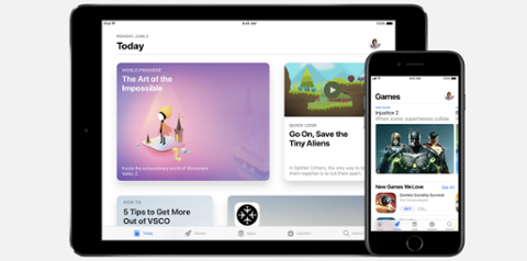
[caption id="attachment_142149" align="aligncenter" width="2970"] The App Store in iOS 11[/caption] With iOS 11, Apple will redesign the App Store in a big way. Flashy, bold and full of the company’s new favorite design aesthetic – big headers – the App Store could offer some winning features for developers. Sadly, it’s also going to hurt many of them. When Apple releases its next iPhone by the end of 2017, it will arrive alongside a new App Store, which is divided into three categories: Games, Apps, and Today. When users open the App Store on their phone, the first screen they’ll see is Today, which is a dynamic view of the apps that Apple editors have chosen to highlight. Being featured prominently in the App Store has never been a straightforward proposition. Often, developers don’t even know how to do it. While some tropes hold true (build a great app, properly utilize Apple’s various tools, etc.), nobody can point to a silver-bullet solution for being featured. Some developers will profit greatly from Today, but many will never see the benefits of this new item. And that leads to the second issue with the new App Store: Games and Apps. The company behind arguably the world's most prominent app platform could be making a mistake it's unaware of. In dividing all apps into two categories, it’s painting the market in broad strokes. This ultimately hurts apps with unclear divisions. As an exercise (pun intended), let’s say that "Pokemon Go," which tasks players with walking around the real world after digital creatures that pop up on their phone, was positioned primarily as a fitness app rather than a game. How would you place it in the new App Store? Is it a game (because Pokemon) or an app (because it’s being framed by its creators as an exercise app)? More to the point, sub-categories in the App Store highlight top paid and grossing apps. The point of the redesign seems to be ubiquity for the most popular apps. In a way, that’s fair; we’ve previously highlighted the severity of the user drop-off once an app hits the 30- and 90-day thresholds. That directly affects monetization for both developers and Apple. App landing pages are also being rethought in this new design. Rather than the download portal we have now, app pages will be more like proper website landing pages. An emphasis on video, product images and snappy text are now a priority. Again, this sounds great, but hits developers hard in an area where they typically don’t thrive. In addition to an app description (now called the ‘subtitle’ field), a new ‘promotional text’ field allows developers to give updates on what’s new with the app. Marketing is not easy; nor is standing out in the App Store. This is true now, but will be increasingly relevant come iOS 11. Having great product images and/or video will likely be a requisite for being featured in Today, as well. Apple says its promotional text field is great for “timely marketing messages, limited-time events, and announcements of new content.” [caption id="attachment_138519" align="aligncenter" width="1360"] Mac App Store WWDC 2016[/caption] Featured apps already get a lion’s share of the income and attention, and that’s also more evident with the new App Store. Rather than just picking a favorite, Apple is also doing things like offering up tutorials for how to get the most out of chosen apps. A photo filtering app such as VSCO may be featured with best-practices for image touch-ups; while those tips may be useful for any photo-editing app, casual users may think it applies directly to VSCO. Perhaps the most glaring problem is that Apple is forcing us down a search pathway. It may be splitting the App Store into three categories, but search is now much more important. The issue here is that App Store search is historically terrible, and it hasn’t seen a dramatic improvement yet. Furthermore, this seems to be part of a larger initiative to make Siri a central part of the iOS experience. In addition to the stylized large header text that will be found throughout iOS 11, a search field now sits in subtext to that header; this is a system-wide change. The App Store is just doing its part to feed Apple more data for Siri by further encouraging search. (Plus, leaning harder into search also encourages more developers to buy ad space.)
The Upside
It’s not all bad, of course. These changes follow Apple’s dismissal of an unknown number of 32-bit apps from the App Store, which were simply taking up room. Even though it’s making search a primary tool for discovering apps in the new App Store, it’s cleared the path to help users find good apps. Whether this ultimately performs better than the current system of sub-categories remains to be seen. [caption id="attachment_138521" align="aligncenter" width="3563"] App Store Guidelines Comic WWDC 2016[/caption] A nicer, more contextual app landing page all but encourages developers not to spin up standalone websites for their apps. Rather, those same developers may feel more comfortable simply redirecting their URL to the App Store straight away. Apple’s redesign is a sneaky one. In addition to looking better, it’s a move to help the App Store regain its mantle as a destination for apps rather than a hosting platform. The new App Store also hinges on proper marketing, a skill that eludes many developers: You still need a good video, excellent product shots and text that engages users.
[caption id="attachment_142149" align="aligncenter" width="2970"]The App Store in iOS 11[/caption] The new App Store in iOS 11 will dramatically change how users interact with app landing pages. A new study sho…
Google Play is beating Apple’s iOS App Store in total app downloads, according to the App Annie Market Index. (App Annie builds analytics platforms and statistical tools that parse out data about app ecosystems…
Laura Fitton saw the upcoming apps gold rush coming back in 2009, when she launched the Cambridge-based oneforty.com, a niche app store for Twitter followers and application developers. Since then, she's raised…
Create Your Profile
Sign up for a free Dice profile, add your resume, discover great career insights and set your tech career in motion.
 The App Store in iOS 11[/caption] With iOS 11, Apple will redesign the App Store in a big way. Flashy, bold and full of the company’s new favorite design aesthetic – big headers – the App Store could offer some winning features for developers. Sadly, it’s also going to hurt many of them. When Apple releases its next iPhone by the end of 2017, it will arrive alongside a new App Store, which is divided into three categories: Games, Apps, and Today. When users open the App Store on their phone, the first screen they’ll see is Today, which is a dynamic view of the apps that Apple editors have chosen to highlight. Being featured prominently in the App Store has never been a straightforward proposition. Often, developers don’t even know how to do it. While some tropes hold true (build a great app, properly utilize Apple’s various tools, etc.), nobody can point to a silver-bullet solution for being featured. Some developers will profit greatly from Today, but many will never see the benefits of this new item. And that leads to the second issue with the new App Store: Games and Apps. The company behind arguably the world's most prominent app platform could be making a mistake it's unaware of. In dividing all apps into two categories, it’s painting the market in broad strokes. This ultimately hurts apps with unclear divisions. As an exercise (pun intended), let’s say that "Pokemon Go," which tasks players with walking around the real world after digital creatures that pop up on their phone, was positioned primarily as a fitness app rather than a game. How would you place it in the new App Store? Is it a game (because Pokemon) or an app (because it’s being framed by its creators as an exercise app)? More to the point, sub-categories in the App Store highlight top paid and grossing apps. The point of the redesign seems to be ubiquity for the most popular apps. In a way, that’s fair; we’ve previously highlighted the severity of the user drop-off once an app hits the 30- and 90-day thresholds. That directly affects monetization for both developers and Apple. App landing pages are also being rethought in this new design. Rather than the download portal we have now, app pages will be more like proper website landing pages. An emphasis on video, product images and snappy text are now a priority. Again, this sounds great, but hits developers hard in an area where they typically don’t thrive. In addition to an app description (now called the ‘subtitle’ field), a new ‘promotional text’ field allows developers to give updates on what’s new with the app. Marketing is not easy; nor is standing out in the App Store. This is true now, but will be increasingly relevant come iOS 11. Having great product images and/or video will likely be a requisite for being featured in Today, as well. Apple says its promotional text field is great for “timely marketing messages, limited-time events, and announcements of new content.” [caption id="attachment_138519" align="aligncenter" width="1360"]
  Mac App Store WWDC 2016[/caption] Featured apps already get a lion’s share of the income and attention, and that’s also more evident with the new App Store. Rather than just picking a favorite, Apple is also doing things like offering up tutorials for how to get the most out of chosen apps. A photo filtering app such as VSCO may be featured with best-practices for image touch-ups; while those tips may be useful for any photo-editing app, casual users may think it applies directly to VSCO. Perhaps the most glaring problem is that Apple is forcing us down a search pathway. It may be splitting the App Store into three categories, but search is now much more important. The issue here is that App Store search is historically terrible, and it hasn’t seen a dramatic improvement yet. Furthermore, this seems to be part of a larger initiative to make Siri a central part of the iOS experience. In addition to the stylized large header text that will be found throughout iOS 11, a search field now sits in subtext to that header; this is a system-wide change. The App Store is just doing its part to feed Apple more data for Siri by further encouraging search. (Plus, leaning harder into search also encourages more developers to buy ad space.)
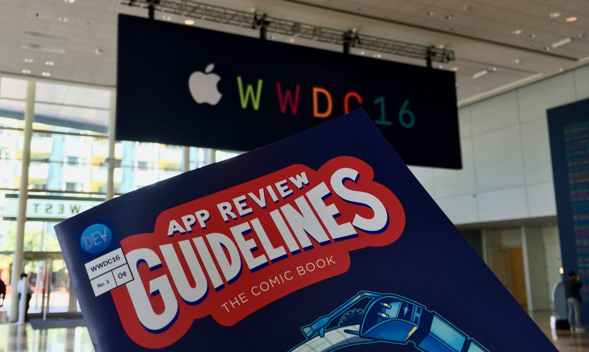 App Store Guidelines Comic WWDC 2016[/caption] A nicer, more contextual app landing page all but encourages developers not to spin up standalone websites for their apps. Rather, those same developers may feel more comfortable simply redirecting their URL to the App Store straight away. Apple’s redesign is a sneaky one. In addition to looking better, it’s a move to help the App Store regain its mantle as a destination for apps rather than a hosting platform. The new App Store also hinges on proper marketing, a skill that eludes many developers: You still need a good video, excellent product shots and text that engages users.