With iOS 13, Apple finally made some long overdue changes to support more effective customizations of the tab bars, as well as tool bars in your apps.
The new UITabBarAppearance, UIBarAppearance, and related classes lets developers easily modify not just the basics such as background and selected colors but spacing, text attributes, badging, and positioning. Creating subtle effects around tab bar item selection that would have been non-trivial in the past is much simpler now.
The Old Way
In iOS 12, you might have done something like the following to set the background color and selected/unselected tab bar item colors:
//Set the background color
    UITabBar.appearance().backgroundColor = .red
    tabBar.backgroundImage = UIImage()   //Clear background

    //Set the item tint colors
    tabBar.tintColor = .white
    tabBar.unselectedItemTintColor = .lightGray
Using UIAppearance to set global properties such as background color worked well, but no longer works as consistently with iOS 13 (although it still will generally work). I’ve noticed issues in particular with flaky tab bar appearance on iPad within UISplitViewController classes and some other scenarios in iOS 13.
New and Improved!
With the new classes in iOS 13 you now set the tab bar background color with the UITabBarAppearance class and backgroundColor property. Note the availability check on the method below as this is only available in iOS 13+. (if you are not supporting older versions of iOS, this obviously wouldn’t be needed). Here we just set the tab bar background to red and assign the standard appearance.
//This example assumes a custom UITabBarController overridden class.  You can
    //also use it anywhere the `tabBar` of the current `tabBarController` is available.
    let appearance = UITabBarAppearance()
    appearance.backgroundColor = .red
    tabBar.standardAppearance = appearance
Setting the color on the selected and unselected tab bar icons and text is now done through the new UITabBarItemAppearance class. You can then just use the default normal, selected, disabled, or focused properties that are available and already instantiated to set iconColor, titleTextAttributes, or other properties. Below is a function to update the colors for normal and selected tab bar items.
@available(iOS 13.0, *)
    private func setTabBarItemColors(_ itemAppearance: UITabBarItemAppearance) {
        itemAppearance.normal.iconColor = .lightGray
        itemAppearance.normal.titleTextAttributes = [NSAttributedString.Key.foregroundColor: UIColor.lightGray]

        itemAppearance.selected.iconColor = .white
        itemAppearance.selected.titleTextAttributes = [NSAttributedString.Key.foregroundColor: UIColor.white]
    }
We can just call the above function for each appropriate appearance – stacked, inline, or compact inline. iOS 13 will generally select the layout most appropriate to the size class that you select (e.g. stacked for portrait iPhone view and inline for landscape iPhone view on an iPhone 11 Pro Max).
//Set all possible tab bar item styles as necessary (based on rotation and size capabilities).  Here
    //we're setting all three available appearances
    setTabBarItemColors(appearance.stackedLayoutAppearance)
    setTabBarItemColors(appearance.inlineLayoutAppearance)
    setTabBarItemColors(appearance.compactInlineLayoutAppearance)
This will result in a UI similar to the following for landscape or portrait representations:
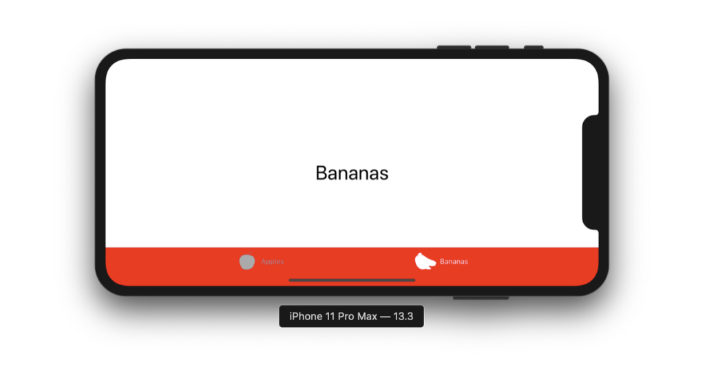
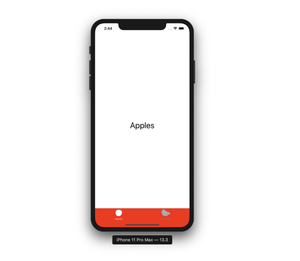
Notice the differing stacked and inline appearances based on the iPhone rotation above. If you want to adjust other characteristics such as the title position (say, to move it further or closer to the icon), font, etc., it’s simple enough to do with the titleTextAttributes and titlePositionAdjustment properties.
Setting Tab Bar Item Badge Appearance
In the screenshot below, we’ve got a blue badge instead of the default red one, and it’s been moved so that it overlaps the top of the navigation bar.
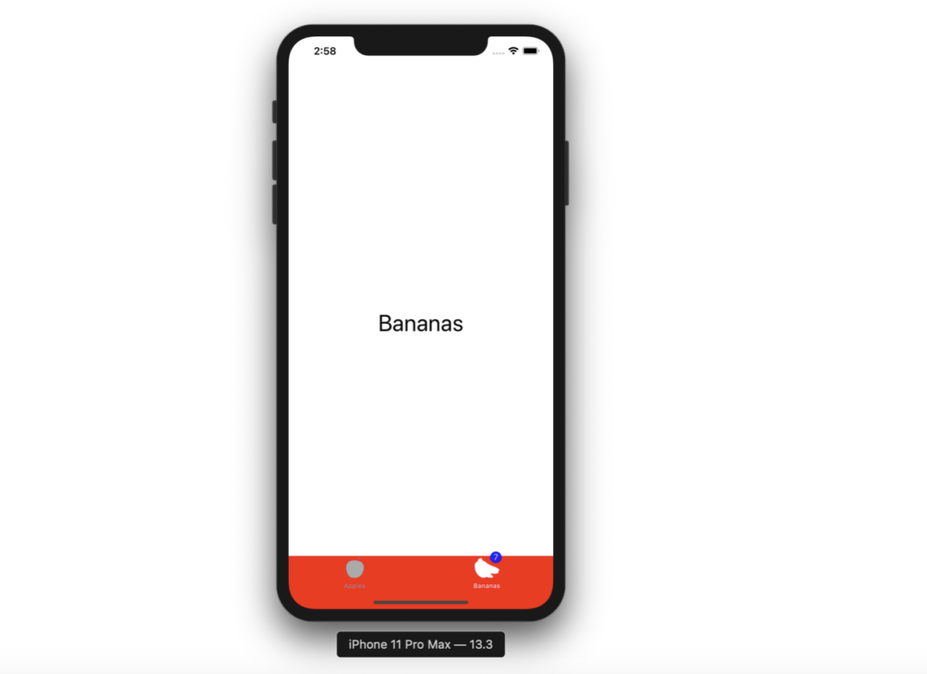
To do this, we just set the badgeBackgroundColor, badgeTextAttributes, and badgePositionAdjustment properties on UITabBarItemAppearance such as below:
@available(iOS 13.0, *)
    private func setTabBarItemBadgeAppearance(_ itemAppearance: UITabBarItemAppearance) {
        //Adjust the badge position as well as set its color
        itemAppearance.normal.badgeBackgroundColor = .blue
        itemAppearance.normal.badgeTextAttributes = [NSAttributedString.Key.foregroundColor: UIColor.white]
        itemAppearance.normal.badgePositionAdjustment = UIOffset(horizontal: 10, vertical: -10)
    }
Conclusion
I hope you’ve enjoyed the above and learned something about the new tab bar appearance classes. Make sure to check out the documentation at the links above as well as the other derived UIBarAppearance classes such as UINavigationBarAppearance and UIToolBarAppearance. Hopefully some of the ugly subclassing and iterative loops through nav bars, tab bars, and tool bars is a thing of the past!
This article originally appeared in eMpTy Theory.
(If you’re just joining us, we have a variety of Swift micro-tutorials: check out how to work with functions, loops, strings, sets, arrays, and the Swift Package Manager.)