Few developers today would argue that
responsive design is only a “nice to have.” With mobile devices pretty much ubiquitous, the idea of having a mobile-friendly web site is usually topmost in the minds of any organization that takes its online presence seriously. “No one in their right mind would design only for the desktop,” said Rich Angermiller, president of Dragonfly Interactive, a design and development firm in Jersey City, NJ. “It’s not about size, it’s about usability—swiping, touching, switching between portrait and landscape modes.” Nowadays, Angermiller believes, “anything done on a desktop should be able to happen on mobile.” That said, the idea of “mobile-first” still might not be far-reaching enough to stand as a governing approach to website development. Today, mobile technology is spreading beyond touch-screen devices such as smartphones and tablets to wearables like the health-focused Fitbit and a variety of smartwatches. In the years ahead, the burgeoning Internet of Things may allow you to interact with everything from your car to your furnace via screen. As a result, mobile design is becoming more action-oriented, said Bob Weber, president and owner of the development firm Weblications in Princeton, NJ. He predicts more businesses will tailor specific mobile apps to address specific types of tasks rather than try to cram more and more options into their websites. “It’s still challenging to buy something on a smartphone without an app,” he pointed out.
Not All Mobile Environments are Created Equal
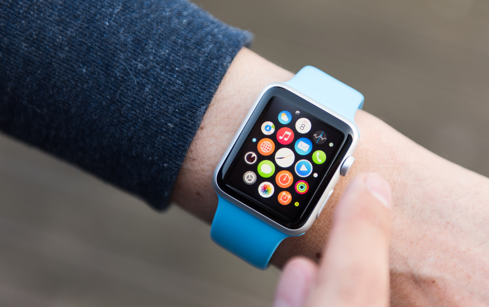
The question, then, is where does responsive design’s usefulness end? As Angermiller put it, “The potential of wearables is pretty amazing, but is it realistic to think you can present meaningful information on a watch?” The answer “comes down to practicality,” he said. “Are you going to sell BMWs through a smart watch? I can’t see it.” Like Weber, Angermiller sees wearables as “a different animal” than smartphones or tablets. Whereas responsive design essentially produces websites that deliver an optimal experience on the go, wearable devices tend to be linked with specific functions. “The Apple watch is a wonderful device, but [in terms of content] mostly for getting push notices,” Weber said. “You’re not going to see websites go to wearables. They (wearables) can do a lot, but they can’t do complex kinds of things.” The same can be said for the Internet of Things, he believes. In that arena, Weber sees wearable devices augmenting apps. For example, your smart watch might tell the app controlling your home’s heating system that the temperature’s too cold. In either case, the design demands are sure to be divorced from those of the company’s or product’s website.
Some Things Stay the Same—for Now
Interestingly, Weber—whose company only follows responsive design practices—thinks that eventually the mobile web will be replaced by apps. In some ways, it may be that responsive design is something of a bridge strategy for providing the best possible experience across a range of device types while new technologies work their way into the mainstream. Meanwhile, those designers who employ a mobile website to double as the desktop version may be saving time but creating problems for at least some segments of their audience. For one thing, mobile functionality remains more limited than desktop functionality, meaning such sites offer an unnecessarily restrictive approach to desktop users. Then, there’s the nature of the audience to consider. “It your audience is in their 40s or 50s, they may prefer the traditional web approach,” Weber said. “You have to transition carefully as demographics change.” All this means that, like everything else in technology, the state of responsive design is fluid, and designers and developers face the challenge of keeping up. Angermiller noted that, as mobile devices proliferate, media queries—when an app pings a device about its characteristics so it can return the correct display and functions—are becoming more difficult to address. Because some devices have much higher resolutions than others, sites must often store the same image in two or three different sizes to make sure it’s presented correctly across devices. In addition, choosing an image becomes more difficult as designers hunt for pictures that not only convey the right message, but offer a layout and tonality that will accommodate different approaches to, say, text wrapping and banner placement. But however the technology changes, Angermiller is sure of one thing: For designers and developers, “the biggest challenge is still trying to be unique.”