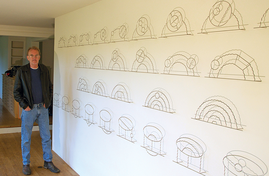
 Statistician and data-visualization pioneer Edward Tufte is a legend for his ability to take the most complicated datasets and transform them into a visual language that even casual viewers can understand. A Professor Emeritus of Political Science, Statistics, and Computer Science at Yale, Tufte’s influence is widely felt; his four books on data visualization are used the world over by UI, UX, and graphic designers. If that wasn’t enough, he’s also a fine artist. One of his best-known works is a sculpture series of Feynman Diagrams, physicist Richard Feynman’s visualizations describing the behavior of subatomic particles. The series is currently housed at ArtCenter in Pasadena, Calif. Dice spoke with Tufte about the commonalities between data visualization and the creation of such conceptual and cognitive artwork. (The interview has been condensed for space and clarity.) Did your experiences with data visualization and art inform one another when you were creating the Feynman sculpture series? It's fairly straightforward. Feynman Diagrams are probably the best individualism in history. They're based on very hairy mathematical equations that go from the theory of how subatomic particles behave, and have been a working visual tool of physicists for the past 60 or 70 years. They’re a spectacular combination. I started on them because I designed this kind of crackpot sculpture of a huge rocket with an Airstream trailer on the end and it was going to Mars. It's like 80 feet long. Aliens can't make any sense of a NASA logo or the flag, but chances are they'll be smarter than we are: they'll see the Feynman Diagrams, which I put on the side of the trailer, and think that the beings inside are really pretty smart. What it does is make a point about the universality of the laws of nature that apply to every particle in the universe forever. It was done as a prankish thing and then it became, more and more, art. They’re made of stainless steel, which generates a beautiful soft light. I put them a few centimeters off the wall on pins so they have shadows. If the light changes or if the sunlight changes the shadows change. If I have a painting on the wall, after three months I can't see it anymore. But out in the sculpture fields, every day is different. The light is different. Every day you have fresh eyes. Is this also the way you’re creating data visualizations? Are you teaching people how to think and see with “fresh eyes"? Yes. My books are secretly an effort to make people smarter. To understand the relationship between information and conclusions, you have to understand the representations of the information and quality of it and the quality analysis, as well as ask, “Can that body of information support conclusions?” I’ll give a lecture at the Art Center called “The Thinking Eye.” It makes this idea of being smart overtly about ‘the thinking eye,’ which is the last interface. It's not a computer screen. It's not some product. It's the light that hits our eye and looks into our brain. Can we make our brain better? Can we improve our thinking so we can understand the credibility and meaning of the light? Do you use data-visualization models in the creation of your artwork? The Feynman Diagrams and my books, because they eventually turned into art. As for the rest of the art, I would say no. But what they have in common is that I like to see and I like to make things. I physically make books. I design and publish them but otherwise I don’t think that way. I just go to the studio and get to work. What the visualization and art have in common is intense seeing and reasoning about visual things, and executing and producing and making things. Another way to put it is: the world is a lot more interesting than any one particular discipline, and I'm interested in so many different things. I never felt that I needed to get a license or take a course. I just get my stuff done. I dined out on breaking discipline boundaries all my life. Many Dice readers code, develop and such. If they’re interested in data visualization, how would you recommend they exercise that “thinking eye"? Get outside and cultivate concentration on outside things. It's very important not to see with words but to see with vacation eyes, innocent eyes. The way I generally learn is by going to the most excellent work in a field and seeing what they're doing. The best data visualization person ever was Galileo. He had Big Data with his telescope. He had gigabytes of visual data and he was a beautiful shower of information. Every time I need an idea, I go to his collected papers and there's something there because he’s envisioning things in three dimensions over time. That's a fundamental thing. And so the way to go into a field is to find the very best work and ask: “What are they thinking about? What are they doing? How are they doing this?”
 Edward Tufte on Data Visualizations and Art
Statistician and data-visualization pioneer Edward Tufte is a legend for his ability to take the most complicated datasets and transform them into a visual language that even casual viewers can understand. A Professor Emeritus of Political Science, Statistics, and Computer Science at Yale, Tufte’s influence is widely felt; his four books on data visualization are used the world over by UI, UX, and graphic designers. If that wasn’t enough, he’s also a fine artist. One of his best-known works is a sculpture series of Feynman Diagrams, physicist Richard Feynman’s visualizations describing the behavior of subatomic particles. The series is currently housed at ArtCenter in Pasadena, Calif. Dice spoke with Tufte about the commonalities between data visualization and the creation of such conceptual and cognitive artwork. (The interview has been condensed for space and clarity.) Did your experiences with data visualization and art inform one another when you were creating the Feynman sculpture series? It's fairly straightforward. Feynman Diagrams are probably the best individualism in history. They're based on very hairy mathematical equations that go from the theory of how subatomic particles behave, and have been a working visual tool of physicists for the past 60 or 70 years. They’re a spectacular combination. I started on them because I designed this kind of crackpot sculpture of a huge rocket with an Airstream trailer on the end and it was going to Mars. It's like 80 feet long. Aliens can't make any sense of a NASA logo or the flag, but chances are they'll be smarter than we are: they'll see the Feynman Diagrams, which I put on the side of the trailer, and think that the beings inside are really pretty smart. What it does is make a point about the universality of the laws of nature that apply to every particle in the universe forever. It was done as a prankish thing and then it became, more and more, art. They’re made of stainless steel, which generates a beautiful soft light. I put them a few centimeters off the wall on pins so they have shadows. If the light changes or if the sunlight changes the shadows change. If I have a painting on the wall, after three months I can't see it anymore. But out in the sculpture fields, every day is different. The light is different. Every day you have fresh eyes. Is this also the way you’re creating data visualizations? Are you teaching people how to think and see with “fresh eyes"? Yes. My books are secretly an effort to make people smarter. To understand the relationship between information and conclusions, you have to understand the representations of the information and quality of it and the quality analysis, as well as ask, “Can that body of information support conclusions?” I’ll give a lecture at the Art Center called “The Thinking Eye.” It makes this idea of being smart overtly about ‘the thinking eye,’ which is the last interface. It's not a computer screen. It's not some product. It's the light that hits our eye and looks into our brain. Can we make our brain better? Can we improve our thinking so we can understand the credibility and meaning of the light? Do you use data-visualization models in the creation of your artwork? The Feynman Diagrams and my books, because they eventually turned into art. As for the rest of the art, I would say no. But what they have in common is that I like to see and I like to make things. I physically make books. I design and publish them but otherwise I don’t think that way. I just go to the studio and get to work. What the visualization and art have in common is intense seeing and reasoning about visual things, and executing and producing and making things. Another way to put it is: the world is a lot more interesting than any one particular discipline, and I'm interested in so many different things. I never felt that I needed to get a license or take a course. I just get my stuff done. I dined out on breaking discipline boundaries all my life. Many Dice readers code, develop and such. If they’re interested in data visualization, how would you recommend they exercise that “thinking eye"? Get outside and cultivate concentration on outside things. It's very important not to see with words but to see with vacation eyes, innocent eyes. The way I generally learn is by going to the most excellent work in a field and seeing what they're doing. The best data visualization person ever was Galileo. He had Big Data with his telescope. He had gigabytes of visual data and he was a beautiful shower of information. Every time I need an idea, I go to his collected papers and there's something there because he’s envisioning things in three dimensions over time. That's a fundamental thing. And so the way to go into a field is to find the very best work and ask: “What are they thinking about? What are they doing? How are they doing this?” 