 Look, Ma: no lines![/caption] Google has revamped its search-results pages, removing the underlining that helped define hyperlinks for the past several years. “We've increased the size of result titles, removed the underlines, and evened out all the line heights,” Jon Wiley, lead designer for Google Search, wrote on his Google+ page. “This improves readability and creates an overall cleaner look. We've also brought over our new ad labels from mobile, making the multi-device experience more consistent.” He added: “Improving consistency in design across platforms makes it easier for people to use Google Search across devices and it makes it easier for us to develop and ship improvements across the board.” As Webpage redesigns go, this isn’t radical; nonetheless, it’s notable because Google, always reluctant to do anything to its core Website that might upset users (and, by extension, affect its ad revenue), adjusts its search-results pages infrequently. Just this week, in fact, Google terminated an experiment that displayed sizable banner ads across the top of results: according to Marketing Land, Google search overlord Amit Singhal suggested during a keynote at the SMX West that the test didn’t deliver the desired results. Even as it keeps its search engine’s aesthetic largely unchanged, Google regularly tinkers with the underlying algorithms. In September 2013, for example, it announced “Hummingbird,” an update built to better leverage voice searches and complex queries. Every time Google shifts its math, it unleashes a period of intense confusion and worry among advertisers and publishers who depend on search rankings for page-views and revenue. Ultimately, Google wants to integrate its search as seamlessly as possible into people’s lives, with an increasing emphasis on voice queries as a way of communicating with its products. The company is also leaning heavily on a “cards”-based interface for search results, especially on Android, rather than the “traditional” page of blue hyperlinks. Some longtime Web denizens might miss the underlining as an artifact of the “old school” Web, but Google isn’t being sentimental. Image: Google
 Google Revamps Its Search-Results Pages
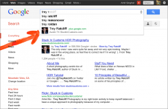
[caption id="attachment_18142" align="aligncenter" width="618"] Look, Ma: no lines![/caption] Google has revamped its search-results pages, removing the underlining that helped define hyperlinks for the past several years. “We've increased the size of result titles, removed the underlines, and evened out all the line heights,” Jon Wiley, lead designer for Google Search, wrote on his Google+ page. “This improves readability and creates an overall cleaner look. We've also brought over our new ad labels from mobile, making the multi-device experience more consistent.” He added: “Improving consistency in design across platforms makes it easier for people to use Google Search across devices and it makes it easier for us to develop and ship improvements across the board.” As Webpage redesigns go, this isn’t radical; nonetheless, it’s notable because Google, always reluctant to do anything to its core Website that might upset users (and, by extension, affect its ad revenue), adjusts its search-results pages infrequently. Just this week, in fact, Google terminated an experiment that displayed sizable banner ads across the top of results: according to Marketing Land, Google search overlord Amit Singhal suggested during a keynote at the SMX West that the test didn’t deliver the desired results. Even as it keeps its search engine’s aesthetic largely unchanged, Google regularly tinkers with the underlying algorithms. In September 2013, for example, it announced “Hummingbird,” an update built to better leverage voice searches and complex queries. Every time Google shifts its math, it unleashes a period of intense confusion and worry among advertisers and publishers who depend on search rankings for page-views and revenue. Ultimately, Google wants to integrate its search as seamlessly as possible into people’s lives, with an increasing emphasis on voice queries as a way of communicating with its products. The company is also leaning heavily on a “cards”-based interface for search results, especially on Android, rather than the “traditional” page of blue hyperlinks. Some longtime Web denizens might miss the underlining as an artifact of the “old school” Web, but Google isn’t being sentimental. Image: Google
Look, Ma: no lines![/caption] Google has revamped its search-results pages, removing the underlining that helped define hyperlinks for the past several years. “We've increased the size of result titles, removed the underlines, and evened out all the line heights,” Jon Wiley, lead designer for Google Search, wrote on his Google+ page. “This improves readability and creates an overall cleaner look. We've also brought over our new ad labels from mobile, making the multi-device experience more consistent.” He added: “Improving consistency in design across platforms makes it easier for people to use Google Search across devices and it makes it easier for us to develop and ship improvements across the board.” As Webpage redesigns go, this isn’t radical; nonetheless, it’s notable because Google, always reluctant to do anything to its core Website that might upset users (and, by extension, affect its ad revenue), adjusts its search-results pages infrequently. Just this week, in fact, Google terminated an experiment that displayed sizable banner ads across the top of results: according to Marketing Land, Google search overlord Amit Singhal suggested during a keynote at the SMX West that the test didn’t deliver the desired results. Even as it keeps its search engine’s aesthetic largely unchanged, Google regularly tinkers with the underlying algorithms. In September 2013, for example, it announced “Hummingbird,” an update built to better leverage voice searches and complex queries. Every time Google shifts its math, it unleashes a period of intense confusion and worry among advertisers and publishers who depend on search rankings for page-views and revenue. Ultimately, Google wants to integrate its search as seamlessly as possible into people’s lives, with an increasing emphasis on voice queries as a way of communicating with its products. The company is also leaning heavily on a “cards”-based interface for search results, especially on Android, rather than the “traditional” page of blue hyperlinks. Some longtime Web denizens might miss the underlining as an artifact of the “old school” Web, but Google isn’t being sentimental. Image: Google