 Google mixes maps and data for directions to Lewis & Clark, good schools or fast food.[/caption] Google's maps and Android-based navigational aids are doing a lot more than providing directions to the hardware store and teaching students to read maps online. Through a new project called Google Maps Gallery, Google is combining maps that few people read for fun with esoteric datasets that few seek out aside from scholars and wonks. The result is "a graphical, interactive atlas" that can take users back in time (cartographically) to follow the trail of Lewis and Clark, watch global warming in action, see how likely a tornado is to touch down nearby, check government-recommended evacuation routes, or see how close they will always be to at least one location of each of the eight largest fast-food chains in the U.S. The Google Maps Gallery is the information-rich result of Google's public-data program, which makes it easier for government agencies and private organizations to import often-dry historical or statistical data into Google's Maps Engine. Combining text or statistical data with location data, and painting the whole thing on an interactive map, creates custom illustrations that show details of specific past events, or highlight subtle changes that may be difficult to display visually. For example, contrasting the mapped images of Edo in 1860 with modern Tokyo shows the enormous changes that followed 300 years of industrialization (except in the area around the Imperial Palace, which survived almost unchanged). Modern maps of the American South overlaid with historical data about the Civil War show not just body counts, but the peculiarities of distance, quality of defensible ground and difficulty of moving supplies, which collectively shaped the war as much as any decision of politicians and generals. Organizations supplying the data control the presentation on their own terms, with their own branding and licensing, so the project acts more as a cloud-based data-illustration service that increases the usefulness of data on local crime rates, the social impact of enrollment in local public schools, Congressional districts, or the impact of environmental disasters. It is also an illustration of how it's possible to combine inaccessible contextual data with visually familiar geographic information to make a complex situation clearer by showing where it happened, to whom, and with what intensity without leaving readers wondering where it happened, or why they should care. Image: Google Maps
 Google Paints History, Current Events Into Maps
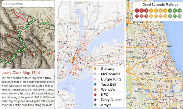
[caption id="attachment_17830" align="aligncenter" width="600"] Google mixes maps and data for directions to Lewis & Clark, good schools or fast food.[/caption] Google's maps and Android-based navigational aids are doing a lot more than providing directions to the hardware store and teaching students to read maps online. Through a new project called Google Maps Gallery, Google is combining maps that few people read for fun with esoteric datasets that few seek out aside from scholars and wonks. The result is "a graphical, interactive atlas" that can take users back in time (cartographically) to follow the trail of Lewis and Clark, watch global warming in action, see how likely a tornado is to touch down nearby, check government-recommended evacuation routes, or see how close they will always be to at least one location of each of the eight largest fast-food chains in the U.S. The Google Maps Gallery is the information-rich result of Google's public-data program, which makes it easier for government agencies and private organizations to import often-dry historical or statistical data into Google's Maps Engine. Combining text or statistical data with location data, and painting the whole thing on an interactive map, creates custom illustrations that show details of specific past events, or highlight subtle changes that may be difficult to display visually. For example, contrasting the mapped images of Edo in 1860 with modern Tokyo shows the enormous changes that followed 300 years of industrialization (except in the area around the Imperial Palace, which survived almost unchanged). Modern maps of the American South overlaid with historical data about the Civil War show not just body counts, but the peculiarities of distance, quality of defensible ground and difficulty of moving supplies, which collectively shaped the war as much as any decision of politicians and generals. Organizations supplying the data control the presentation on their own terms, with their own branding and licensing, so the project acts more as a cloud-based data-illustration service that increases the usefulness of data on local crime rates, the social impact of enrollment in local public schools, Congressional districts, or the impact of environmental disasters. It is also an illustration of how it's possible to combine inaccessible contextual data with visually familiar geographic information to make a complex situation clearer by showing where it happened, to whom, and with what intensity without leaving readers wondering where it happened, or why they should care. Image: Google Maps
Google mixes maps and data for directions to Lewis & Clark, good schools or fast food.[/caption] Google's maps and Android-based navigational aids are doing a lot more than providing directions to the hardware store and teaching students to read maps online. Through a new project called Google Maps Gallery, Google is combining maps that few people read for fun with esoteric datasets that few seek out aside from scholars and wonks. The result is "a graphical, interactive atlas" that can take users back in time (cartographically) to follow the trail of Lewis and Clark, watch global warming in action, see how likely a tornado is to touch down nearby, check government-recommended evacuation routes, or see how close they will always be to at least one location of each of the eight largest fast-food chains in the U.S. The Google Maps Gallery is the information-rich result of Google's public-data program, which makes it easier for government agencies and private organizations to import often-dry historical or statistical data into Google's Maps Engine. Combining text or statistical data with location data, and painting the whole thing on an interactive map, creates custom illustrations that show details of specific past events, or highlight subtle changes that may be difficult to display visually. For example, contrasting the mapped images of Edo in 1860 with modern Tokyo shows the enormous changes that followed 300 years of industrialization (except in the area around the Imperial Palace, which survived almost unchanged). Modern maps of the American South overlaid with historical data about the Civil War show not just body counts, but the peculiarities of distance, quality of defensible ground and difficulty of moving supplies, which collectively shaped the war as much as any decision of politicians and generals. Organizations supplying the data control the presentation on their own terms, with their own branding and licensing, so the project acts more as a cloud-based data-illustration service that increases the usefulness of data on local crime rates, the social impact of enrollment in local public schools, Congressional districts, or the impact of environmental disasters. It is also an illustration of how it's possible to combine inaccessible contextual data with visually familiar geographic information to make a complex situation clearer by showing where it happened, to whom, and with what intensity without leaving readers wondering where it happened, or why they should care. Image: Google Maps