 The reason for encouraging skeuomorphic design was to make the use of an unfamiliar device – a handheld computer with a phone or a tablet computer – more obvious by mimicking devices users would be familiar with. So, buttons on the screen looked like buttons on the electronic devices we use many times a day. This made it obvious that the device was something that should be touched, and that touching would perform some action. The older HIG also encouraged making the function of buttons obvious and not doing anything destructive immediately after a button was pressed. The idea was that users should feel safe exploring the functions of apps. Users are very different now. Mobile apps have been around several years and most people have some familiarity with them. This makes skeuomorphic cues less necessary. Just about every new technology goes through a skeuomorphic phase where the early products mimic something users know. For example, early cars looked like horse drawn carriages and early computers looked like high-end stereo equipment. As users become familiar with the use of products, design is optimized for the function and skeuomorphic elements disappear. If you were to put a driver from 1963 into a 2013 car, they would be completely mystified by many of the controls. Remote entry alarm systems were not available in 1963, so how to get into the car without setting off the alarm wouldn’t be obvious. Once they were in the car, how to start it might not be obvious since many now don’t use a key. Finally, starting a car with fuel injection, as nearly every car now has, requires a somewhat different procedure from starting a carbureted car. It would take significant training to teach the 1963 driver how to use the audio system (OK, I get AM and heard of FM. What’s a CD and what is this MP3 jack for?). I do think a GPS navigation system would be fairly obvious to our driver from 50 years ago. The maps on the screen work much like the paper maps they are used to using. Perhaps GPS is ready for a UI update? Design is an evolutionary process and we assume that the current user is familiar with previous generations. This creates problems for new users who have not used the earlier generations. The challenge of flat design is in providing functional cues to the user without skeuomorphism. Somehow, the user must know that an area of the screen is active and will respond to a touch without the visual look of a button. Apple is encouraging apps to use animation to provide cues. A great example of this is the home screen, where the tiles move over the background as the user tilts the device. This makes it clear that the tiles are on top of the background and probably do something. There will certainly be apps that will be difficult to use due to poorly done flat design. We all need to look at our apps using the eyes of both experienced and new users to ensure that function can be discerned from the form.
 The Challenge of Flat Design
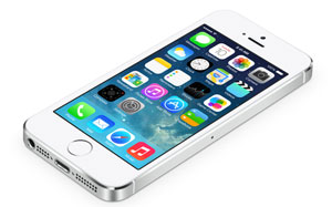
Like just about every iOS developer, I’ve starting working on updating apps to be consistent with Apple’s latest Human Interface Guidelines (HIG). All previous versions of the HIG strongly recommended skeuomorphic design elements. The latest strongly encourages flat design and strongly discourages skeuomorphism. The reason for encouraging skeuomorphic design was to make the use of an unfamiliar device – a handheld computer with a phone or a tablet computer – more obvious by mimicking devices users would be familiar with. So, buttons on the screen looked like buttons on the electronic devices we use many times a day. This made it obvious that the device was something that should be touched, and that touching would perform some action. The older HIG also encouraged making the function of buttons obvious and not doing anything destructive immediately after a button was pressed. The idea was that users should feel safe exploring the functions of apps. Users are very different now. Mobile apps have been around several years and most people have some familiarity with them. This makes skeuomorphic cues less necessary. Just about every new technology goes through a skeuomorphic phase where the early products mimic something users know. For example, early cars looked like horse drawn carriages and early computers looked like high-end stereo equipment. As users become familiar with the use of products, design is optimized for the function and skeuomorphic elements disappear. If you were to put a driver from 1963 into a 2013 car, they would be completely mystified by many of the controls. Remote entry alarm systems were not available in 1963, so how to get into the car without setting off the alarm wouldn’t be obvious. Once they were in the car, how to start it might not be obvious since many now don’t use a key. Finally, starting a car with fuel injection, as nearly every car now has, requires a somewhat different procedure from starting a carbureted car. It would take significant training to teach the 1963 driver how to use the audio system (OK, I get AM and heard of FM. What’s a CD and what is this MP3 jack for?). I do think a GPS navigation system would be fairly obvious to our driver from 50 years ago. The maps on the screen work much like the paper maps they are used to using. Perhaps GPS is ready for a UI update? Design is an evolutionary process and we assume that the current user is familiar with previous generations. This creates problems for new users who have not used the earlier generations. The challenge of flat design is in providing functional cues to the user without skeuomorphism. Somehow, the user must know that an area of the screen is active and will respond to a touch without the visual look of a button. Apple is encouraging apps to use animation to provide cues. A great example of this is the home screen, where the tiles move over the background as the user tilts the device. This makes it clear that the tiles are on top of the background and probably do something. There will certainly be apps that will be difficult to use due to poorly done flat design. We all need to look at our apps using the eyes of both experienced and new users to ensure that function can be discerned from the form.
The reason for encouraging skeuomorphic design was to make the use of an unfamiliar device – a handheld computer with a phone or a tablet computer – more obvious by mimicking devices users would be familiar with. So, buttons on the screen looked like buttons on the electronic devices we use many times a day. This made it obvious that the device was something that should be touched, and that touching would perform some action. The older HIG also encouraged making the function of buttons obvious and not doing anything destructive immediately after a button was pressed. The idea was that users should feel safe exploring the functions of apps. Users are very different now. Mobile apps have been around several years and most people have some familiarity with them. This makes skeuomorphic cues less necessary. Just about every new technology goes through a skeuomorphic phase where the early products mimic something users know. For example, early cars looked like horse drawn carriages and early computers looked like high-end stereo equipment. As users become familiar with the use of products, design is optimized for the function and skeuomorphic elements disappear. If you were to put a driver from 1963 into a 2013 car, they would be completely mystified by many of the controls. Remote entry alarm systems were not available in 1963, so how to get into the car without setting off the alarm wouldn’t be obvious. Once they were in the car, how to start it might not be obvious since many now don’t use a key. Finally, starting a car with fuel injection, as nearly every car now has, requires a somewhat different procedure from starting a carbureted car. It would take significant training to teach the 1963 driver how to use the audio system (OK, I get AM and heard of FM. What’s a CD and what is this MP3 jack for?). I do think a GPS navigation system would be fairly obvious to our driver from 50 years ago. The maps on the screen work much like the paper maps they are used to using. Perhaps GPS is ready for a UI update? Design is an evolutionary process and we assume that the current user is familiar with previous generations. This creates problems for new users who have not used the earlier generations. The challenge of flat design is in providing functional cues to the user without skeuomorphism. Somehow, the user must know that an area of the screen is active and will respond to a touch without the visual look of a button. Apple is encouraging apps to use animation to provide cues. A great example of this is the home screen, where the tiles move over the background as the user tilts the device. This makes it clear that the tiles are on top of the background and probably do something. There will certainly be apps that will be difficult to use due to poorly done flat design. We all need to look at our apps using the eyes of both experienced and new users to ensure that function can be discerned from the form.