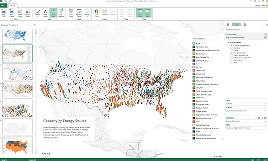
 Microsoft seems intent on improving its Power Map for Excel tool, which allows users to visualize data in 3D. In theory, a Power Map holds a lot of uses for anyone who works with either geospatial or time-based data, which “traditional” 2D charts have a hard time visualizing. With the latest improvements in place, Power Map will now leverage Bing Maps to automatically plot data-points based on the columnar information at hand (city, state, latitude/longitude readings, etc.); that could spare data-workers from having to individually select columns and program accordingly. There’s also a new region-based visualization that color-codes according to zip code, county, state, country, and region—useful for anyone plotting a marketing or political campaign. For those who want a flat map as opposed to a 3D visualization, that’s still possible with Power Map: users can toggle between 2D and 3D when needed (even if it’s just to create a visually impressive effect at presentations). In response to customer requests, Microsoft has also added more languages (Spanish, Japanese, and Arabic, for starters), along with support for calculated fields and hidden columns in Power Pivot. Microsoft has spent the past several months working to make its Office software a more powerful analytics platform. In July, it unveiled Power BI for its cloud-based Office 365, which gives small and midsize businesses the ability to “self serve” data analytics. Microsoft is also pushing Power Query, a tool for stitching together massive datasets. While Office-based analytics aren’t exactly a threat to the massive data-crunching platforms marketed by the likes of SAP and IBM, the software does give office workers the ability to perform more lightweight data analysis on the fly. Image: Microsoft
 Microsoft Improving Power Map for Excel
 Microsoft seems intent on improving its Power Map for Excel tool, which allows users to visualize data in 3D. In theory, a Power Map holds a lot of uses for anyone who works with either geospatial or time-based data, which “traditional” 2D charts have a hard time visualizing. With the latest improvements in place, Power Map will now leverage Bing Maps to automatically plot data-points based on the columnar information at hand (city, state, latitude/longitude readings, etc.); that could spare data-workers from having to individually select columns and program accordingly. There’s also a new region-based visualization that color-codes according to zip code, county, state, country, and region—useful for anyone plotting a marketing or political campaign. For those who want a flat map as opposed to a 3D visualization, that’s still possible with Power Map: users can toggle between 2D and 3D when needed (even if it’s just to create a visually impressive effect at presentations). In response to customer requests, Microsoft has also added more languages (Spanish, Japanese, and Arabic, for starters), along with support for calculated fields and hidden columns in Power Pivot. Microsoft has spent the past several months working to make its Office software a more powerful analytics platform. In July, it unveiled Power BI for its cloud-based Office 365, which gives small and midsize businesses the ability to “self serve” data analytics. Microsoft is also pushing Power Query, a tool for stitching together massive datasets. While Office-based analytics aren’t exactly a threat to the massive data-crunching platforms marketed by the likes of SAP and IBM, the software does give office workers the ability to perform more lightweight data analysis on the fly. Image: Microsoft