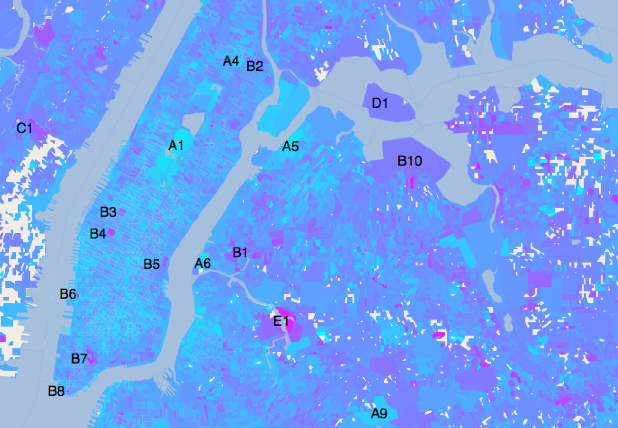
 New York City: the redder the map section, the more miserable the people (at least on Twitter).[/caption] A new research paper from the New England Complex Systems Institute, titled “Sentiment in New York City” (PDF), attempts to pull off something that would have been impossible—or at least mind-bogglingly difficult—before the invention of online social networks: figure out the block-by-block happiness level of the biggest metropolis in the United States. In order to generate their “sentiment map” of New York City, the researchers analyzed data from 603,954 Tweets (collected via Twitter’s API) organized by census block. “This method, combined with geotagging provided by users, enables us to gauge public sentiment on extremely fine-grained spatial and temporal scales,” read the paper’s abstract. The study took emoticons and word choice into account when deciding whether particular Tweets were positive or negative in sentiment. According to that flood of geotagged Tweets, people are happiest near New York City’s public parks, and unhappiest near transportation hubs. Happiness increased closer to Times Square, the declined around Penn Station, the Port Authority, and the entrance to the Midtown Tunnel. People were in a better mood at night and on weekends, and more negative about the world between the hours of 9 A.M. and 12 P.M. None of this is surprising: who wouldn’t be happy amidst the greenery of a public park, or borderline-suicidal while stuck in traffic or waiting for a late train? The correlation between happiness and Times Square is almost certainly due to that neighborhood’s massive influx of tourists, all of them Tweeting about their vacation. But as with previous public-sentiment studies, using Twitter as a primary data source also introduces some methodology issues: for example, a flood of happy Tweets from tourists could disguise a more subdued and longstanding misery among a neighborhood’s residents, many of whom probably aren’t tweeting every thirty seconds about a Broadway show or the quality of Guy Fieri’s food. Twitter is also vulnerable to temporary bursts of outsized negative sentiment. If the map shows Hunter College High School as a wellspring of misery of which the world has never seen, it’s probably because the study was conducted during the two-week period in April 2012, which overlapped with students returning from spring break. A couple thousand students wailing on Twitter could surely skew the final results. That being said, some locations on the map seem freighted with negative sentiment irrespective of events during the data-collection period. The study notes that Maspeth Creek in Brooklyn, a notoriously polluted waterway, is an “area with markedly negative sentiment.” No doubt residents are Tweeting about the pollution and stink. Had the researchers extended their data-collection period to months or years, it’s likely the results would have stayed much the same: tourists Tweet about the neon glories of Times Square all year, and residents will broadcast their hatred of the onramp to the Brooklyn Bridge until the end of time. But such research begs the question: what would the sentiment map look like if more data—from Facebook, news reports, or even blogs—was layered onto it? Image: New England Complex Systems Institute
 The Saddest Spots in New York City
[caption id="attachment_11728" align="aligncenter" width="618"]  New York City: the redder the map section, the more miserable the people (at least on Twitter).[/caption] A new research paper from the New England Complex Systems Institute, titled “Sentiment in New York City” (PDF), attempts to pull off something that would have been impossible—or at least mind-bogglingly difficult—before the invention of online social networks: figure out the block-by-block happiness level of the biggest metropolis in the United States. In order to generate their “sentiment map” of New York City, the researchers analyzed data from 603,954 Tweets (collected via Twitter’s API) organized by census block. “This method, combined with geotagging provided by users, enables us to gauge public sentiment on extremely fine-grained spatial and temporal scales,” read the paper’s abstract. The study took emoticons and word choice into account when deciding whether particular Tweets were positive or negative in sentiment. According to that flood of geotagged Tweets, people are happiest near New York City’s public parks, and unhappiest near transportation hubs. Happiness increased closer to Times Square, the declined around Penn Station, the Port Authority, and the entrance to the Midtown Tunnel. People were in a better mood at night and on weekends, and more negative about the world between the hours of 9 A.M. and 12 P.M. None of this is surprising: who wouldn’t be happy amidst the greenery of a public park, or borderline-suicidal while stuck in traffic or waiting for a late train? The correlation between happiness and Times Square is almost certainly due to that neighborhood’s massive influx of tourists, all of them Tweeting about their vacation. But as with previous public-sentiment studies, using Twitter as a primary data source also introduces some methodology issues: for example, a flood of happy Tweets from tourists could disguise a more subdued and longstanding misery among a neighborhood’s residents, many of whom probably aren’t tweeting every thirty seconds about a Broadway show or the quality of Guy Fieri’s food. Twitter is also vulnerable to temporary bursts of outsized negative sentiment. If the map shows Hunter College High School as a wellspring of misery of which the world has never seen, it’s probably because the study was conducted during the two-week period in April 2012, which overlapped with students returning from spring break. A couple thousand students wailing on Twitter could surely skew the final results. That being said, some locations on the map seem freighted with negative sentiment irrespective of events during the data-collection period. The study notes that Maspeth Creek in Brooklyn, a notoriously polluted waterway, is an “area with markedly negative sentiment.” No doubt residents are Tweeting about the pollution and stink. Had the researchers extended their data-collection period to months or years, it’s likely the results would have stayed much the same: tourists Tweet about the neon glories of Times Square all year, and residents will broadcast their hatred of the onramp to the Brooklyn Bridge until the end of time. But such research begs the question: what would the sentiment map look like if more data—from Facebook, news reports, or even blogs—was layered onto it? Image: New England Complex Systems Institute
 New York City: the redder the map section, the more miserable the people (at least on Twitter).[/caption] A new research paper from the New England Complex Systems Institute, titled “Sentiment in New York City” (PDF), attempts to pull off something that would have been impossible—or at least mind-bogglingly difficult—before the invention of online social networks: figure out the block-by-block happiness level of the biggest metropolis in the United States. In order to generate their “sentiment map” of New York City, the researchers analyzed data from 603,954 Tweets (collected via Twitter’s API) organized by census block. “This method, combined with geotagging provided by users, enables us to gauge public sentiment on extremely fine-grained spatial and temporal scales,” read the paper’s abstract. The study took emoticons and word choice into account when deciding whether particular Tweets were positive or negative in sentiment. According to that flood of geotagged Tweets, people are happiest near New York City’s public parks, and unhappiest near transportation hubs. Happiness increased closer to Times Square, the declined around Penn Station, the Port Authority, and the entrance to the Midtown Tunnel. People were in a better mood at night and on weekends, and more negative about the world between the hours of 9 A.M. and 12 P.M. None of this is surprising: who wouldn’t be happy amidst the greenery of a public park, or borderline-suicidal while stuck in traffic or waiting for a late train? The correlation between happiness and Times Square is almost certainly due to that neighborhood’s massive influx of tourists, all of them Tweeting about their vacation. But as with previous public-sentiment studies, using Twitter as a primary data source also introduces some methodology issues: for example, a flood of happy Tweets from tourists could disguise a more subdued and longstanding misery among a neighborhood’s residents, many of whom probably aren’t tweeting every thirty seconds about a Broadway show or the quality of Guy Fieri’s food. Twitter is also vulnerable to temporary bursts of outsized negative sentiment. If the map shows Hunter College High School as a wellspring of misery of which the world has never seen, it’s probably because the study was conducted during the two-week period in April 2012, which overlapped with students returning from spring break. A couple thousand students wailing on Twitter could surely skew the final results. That being said, some locations on the map seem freighted with negative sentiment irrespective of events during the data-collection period. The study notes that Maspeth Creek in Brooklyn, a notoriously polluted waterway, is an “area with markedly negative sentiment.” No doubt residents are Tweeting about the pollution and stink. Had the researchers extended their data-collection period to months or years, it’s likely the results would have stayed much the same: tourists Tweet about the neon glories of Times Square all year, and residents will broadcast their hatred of the onramp to the Brooklyn Bridge until the end of time. But such research begs the question: what would the sentiment map look like if more data—from Facebook, news reports, or even blogs—was layered onto it? Image: New England Complex Systems Institute