A long time ago simply having a GUI was amazing to those that used it, or a toy to the few million Microsoft DOS users who made up the majority of computer users. But those that preferred a Command Line Interface (CLI) always crowed that they could do things far faster by typing than by using a mouse, and for a subset of them (those that could type 40+ wpm, spent ~30+ hours per week using a CLI, and could remember the commands as well as most remember lyrics to their favorite songs) that was true. Also, scripting is another level upon that which GUIs cannot touch, considering they are like mini-programs. Sure they aren’t compiled, and are much slower than machine code, but they do the same job and anyone with the desire can learn the basics of BASH scripting in a day. But, I digress… As GUIs made the computer more friendly and more people adopted them into their daily lives, new UI and hardware features were added that had no corollary within the symbol system we have in the physical world. Icon designers struggled to keep up and adopted some symbols from other systems or invented their own piecemeal iconographies since there was no standard icon system to unify the symbol language. As GUI features grew, designers would often make an inspired symbol, and not really make sure people understood them. The World Wide Web’s symbol was a globe with interconnected nodes. And what the hell was this stack of arches? The WiFi symbol which comes from radio: antenna radiation symbolic of the invisible radio waves. While those worked as people got familiar with them, others were a crap shoot. The symbol for a connection has never been solidified as one symbol. One program would show two hands shaking, while another would show a check mark, a third would show a plug in a socket, and still another would show a green light. The list of features kept growing within programs as each tried to capture the market by being the be-all end-all, one-stop shop for whatever they could be used for. At first these lists of features would fit on one standard legal page. But now some programs would require stacks. Of course newer users, who didn’t grow up among the early explorers of computing, suddenly had to learn all these symbols that had no relation to their paradigm, and many would never learn them in the first place. Instead, they’d rely of the text labels or worse: never know the feature existed.
Obsolete Awareness
Without the contextual awareness of those of us who grew up using floppy disks, the save icon is a weird square within a not-quite square symbol. Also, some physical items are going by the wayside and will be as unfamiliar as 5.25-inch floppies to newer users within 10 years. While still around, and widely used by those without computers, the postage stamps or envelope icons for email will lose their contextual meaning. When was the last time you saw a classic AT&T handset outside of a bowling alley, museum or that rare pay phone booth that still has a handset attached to it? The point is not to lament these changes but to point out this loss of context and symbolic meaning, in addition to the growing laundry list of features that has led to designers throwing up their hands over how busy computer screens have become when they are looking to simplify things. It has resulted in many different attempts until we reached the design backlash that we have now. Things are so complex on an expert level user’s screen, such as mine, that the complexity would overwhelm most people. For instance, right now I am running a light load of apps, and I can see three windows behind the one I type in, 28 menu-bar items not related to the app I am using, one mini-player, and the edges of two icons on my screen. If I mouse over to the left edge, my dock comes up with eight permanent icon residents of my most used apps (four currently running), another nine icons of apps currently running, and under the folder division, I have six directories with permanent resident status (Apps, Applications, Utilities, Documents, Home, Downloads) and a minimized Mail window. I am carrying on an iMessage conversation in Apple’s stock Messages app with a friend about a mile away, who is probably lying in bed (it is 12:24AM currently) on her iPhone, chatting about her day. iTunes has a Mesh song playing, and I just got a new message…. On top of all of this, my iPad is patiently waiting for me to get back to this article about Google turning off a user’s account with no warning — locking him out of his entire digital life — within NetBot (an ADN client). So, I can see the designers’ point. Although all of this is self-induced clutter, I, having used GUIs for over 28 years, am perfectly capable of filtering the noisy screens and focusing in on typing this one article. But I am the exception rather than the rule.
Designing for Mere Mortals
I notice a majority of “mere mortal” users only show one window at a time. They never auto-hide their dock and they leave it on the bottom. The dock on the bottom is a waste of precious vertical real estate: thus the first thing I do is move it to the left and turn on auto hide. I also have an app called “Moom” that will arrange my windows with a few clicks. But the designers want to save everyone from clutter, even me. So, they have done the unthinkable. They have violated the first rule of design: “Form follows function.” It is okay to break the rules as long as you know it, and have a good reason to. However, I don’t consider breaking them to make things look nicer a good reason. Now, for many apps, functionality follows form: The look of an app is more important than getting something done with it. Why? Designers have been removing shortcuts to features less-often used by mortal users, but essential for us digerati to move at the speeds we do in the name of simplifying things. What they failed to consider is those 5 to 10 percent of people that do use those features regularly. For those users, they are actually making things more complicated and impairing some from advancing their GUI-savviness. As those of you who have read my previous articles know, I am completely against what I call "the stupification of UIs" because it hurts efficiency. I’m in favor of customizable layouts with optional elements and features advanced users can find and activate. I detailed some of this concept in my blog post about meeting Jef Raskin long ago. I believe that this is the answer to our current UI paradigm so much that, if I could, I would hire Martha Stewart to lay down some of her endorsement (Mc)Lovin’ to say “Options are a good thing” on camera and show it at every dev conference I could find until it became a mantra. Developers would consider adding both approaches whenever anyone asked them to choose between which non-exclusive things to use in their programs. I also believe that the UI and programs should allow for as much or as little clutter as we want. I like being able to hide buttons I never use, such as “buy” and “share” buttons. Oddly enough, the first time I saw this level of customization in an app, it was in Microsoft Word v.5’s before the code base unification. It allowed one to completely customize menus and the list of which menu items appeared and where. That was a step in the right direction.
But Now We Have This
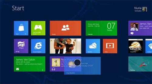
A UI start screen clearly meant for mobile being used out of context: On a desktop that uses all the screen real estate to show huge buttons with colors devoid of meaning that surround icons of clashing detail on a screen lacking both color and layout balance. In short: an inefficient eye sore. And this is just one example, but one of the most current instances of where the entire UI/UX industry is retreating to. I have seen this on OS X, on Chromebooks, on Linux Windows managers and on various mobile devices for years. I do not know who these designers are. I am sure they meant well. But removing functionality is like retreating and burying your head in the sand. And this is after they led the way in interfaces for many years. This current crop of UI designer’s lack of skill at being able to integrate increased functionality in a clear way with finesse means they are not from an actual Interface background, but a raw static design background. I can tell because that is what I was doing to put myself through school about 20 years ago. If they are, in fact, degree carrying members of interface design, then I would judge them as not actually getting the whole point of a GUI, despite their credentials. They avoid improving on tried and true methods of interaction and the symbol system known to work. They fail to recognize the value of adapting the UX to how people work, nor do they make things meaningful, and thus easier to remember and use. For example, how about using color coding? They are navel gazing and seeing who can come up with the sexiest design, not the most usable. I posit that you can tell that weaker UIs are the ones whose commercials never show someone interacting with them. The Windows Tablet commercials come to mind, as they are more a fashion accessory than computer in those. And a fashion accessory is what they are pushing because Microsoft’s marketing people know how to push pretty things, but not how to push functional things. If you look at industrial design in computing before the Second Coming of Jobs, you can see that almost no manufacturers considered marrying form and function. It’s like trucks and hammers: The contractors and carpenters of the world only care that they can do their jobs more easily with less downtime. But marketing only knows how to push and sell attitudes because they have spent the last 50 years training people to respond to evocative advertising, not rational advertising. These UI designers are looking for the approach that makes people think, “That’s new and interesting!” And as we all know, a lifetime of advertising has conditioned people to think that newer things are instantly better. I heard the funniest thing at a club last night: “Oh, you only have the 4S…,” a woman with an iPhone 5 said with pity to a friend of mine. Was she oblivious to the fact that the “poor woman” was running the latest version of iOS as well? Probably. While my iPhone 4 is long in the tooth, and I hope the Flash memory holds out another few months, I am not chomping at the bit for the newer model because it is new, but because of a feature I am pretty sure might make it into iOS 7. Well, that and the fact it will allow me to get more storage — 16GB is way too small these days. I could handle the other platforms scrambling for the new hotness Apple brought with OS X’s “screen you want to lick.” But that new hotness was nothing without a solid UI/UX behind it. iOS would not have been the hit it is and ushered in the modern glass-faced smartphone without the engineers nailing the basic functionality element in the first version. But now, it looks like most of the large companies have lost focus on what really matters to users. Apple itself has done next to nothing to revise the UI of the first iOS, and has fallen behind even dead mobile OSes. The executives making these blunders either don’t know or forget that a person doesn’t develop allegiance to a platform because of a nice look. They develop allegiance because of how easy it is to use. That ease does not mean making a person click through three screens to get to the feature they want to use or, worse, making a person look for the feature for a few minutes among a mess of screens because the designer wanted a cleaner look. It comes from allowing a person to do something quickly and providing feedback that guides them but gets out of the way of those familiar with the device’s operation. It is that simple, but it looks as if this simplicity is lost on them. They have confused simplicity with simple looking screens. At the end of the day, a computer is only a tool. But a tool that requires you to slow down, switch mental modes or impedes you in any way from accomplishing something quickly and easily will make a person less likely to choose the same tool in the future. If the amount of allegiance to a platform based upon the pleasantness and ease of interaction is a foreign concept to some, then let me put it this way. Those people that you love and grew to love in your life might not be the prettiest people out there by modern standards (in fact odds are, they aren’t); they might not be the most stylish or perky, but your love of them is rooted on things that matter more than superficial things: reliability, support, respect and forgiveness. Without these things, a relationship — whether it be between people, corporate entities or human–machine — is not likely to last, especially when a prettier machine comes along. So please, keep that in mind.