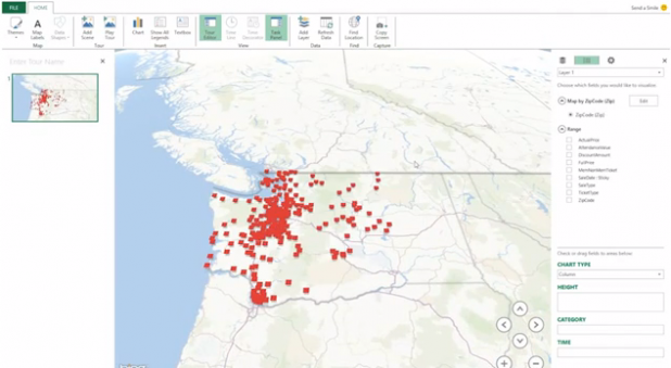
 Microsoft wants to make Excel more of a data-analytics platform. That shouldn’t come as a total surprise, considering how many businesses rely on the software and its various tools to organize and display data. “Arguably, spreadsheets such as Excel are really a class of BI applications,” Howard Dresner, president of Dresner Advisory Services, told SlashBI last year. Excel-based data is routinely supported by analytics applications; and while some might complain that spreadsheets are labor-intensive and excessively error-prone, there’s no doubt the format will remain ubiquitous for quite some time. Microsoft’s upcoming data-visualization project, codenamed “GeoFlow,” will allow Excel users to visualize geographic and chronological data in 3D. It will integrate with Data Explorer and PowerPivot, the software’s preexisting analytics tools. An April 11 posting on the SQL Server Blog suggested GeoFlow could lead to “discoveries in data that might be difficult to identify in traditional 2D tables and charts.” Users can also plot up to a million rows of data in 3D on Bing Maps, the posting added, in order to “see how that data changes over time and share their findings through beautiful screenshots and cinematic, guided video tours.” Visualization remains a key feature of many data-analytics packages. It’s easy to see why: visualizing data in an attractive graph or map can help people—even those without an analytics or mathematical background—understand key trends and concepts. Colorful graphs and maps also serve as better presentation fodder than rows of numbers or tangles of arcane formula. But focusing on visualization can add another complicated layer to developers’ and IT vendors’ workflows. For example, if an analytics platform is also available on mobile devices, someone will have to decide if the mobile version will offer visualizations, as well; and if so, how to best port those visualizations to smaller screens. Visualizing data is also liable to become more popular in coming years, thanks to the rise in Websites such as Wolfram Alpha, which can present all sorts of datasets in particularly colorful ways. With GeoFlow, Microsoft looks like it’s trying to ride that wave. Image: Microsoft
 Microsoft’s GeoFlow Boosts Excel’s Data Visualization
 Microsoft wants to make Excel more of a data-analytics platform. That shouldn’t come as a total surprise, considering how many businesses rely on the software and its various tools to organize and display data. “Arguably, spreadsheets such as Excel are really a class of BI applications,” Howard Dresner, president of Dresner Advisory Services, told SlashBI last year. Excel-based data is routinely supported by analytics applications; and while some might complain that spreadsheets are labor-intensive and excessively error-prone, there’s no doubt the format will remain ubiquitous for quite some time. Microsoft’s upcoming data-visualization project, codenamed “GeoFlow,” will allow Excel users to visualize geographic and chronological data in 3D. It will integrate with Data Explorer and PowerPivot, the software’s preexisting analytics tools. An April 11 posting on the SQL Server Blog suggested GeoFlow could lead to “discoveries in data that might be difficult to identify in traditional 2D tables and charts.” Users can also plot up to a million rows of data in 3D on Bing Maps, the posting added, in order to “see how that data changes over time and share their findings through beautiful screenshots and cinematic, guided video tours.” Visualization remains a key feature of many data-analytics packages. It’s easy to see why: visualizing data in an attractive graph or map can help people—even those without an analytics or mathematical background—understand key trends and concepts. Colorful graphs and maps also serve as better presentation fodder than rows of numbers or tangles of arcane formula. But focusing on visualization can add another complicated layer to developers’ and IT vendors’ workflows. For example, if an analytics platform is also available on mobile devices, someone will have to decide if the mobile version will offer visualizations, as well; and if so, how to best port those visualizations to smaller screens. Visualizing data is also liable to become more popular in coming years, thanks to the rise in Websites such as Wolfram Alpha, which can present all sorts of datasets in particularly colorful ways. With GeoFlow, Microsoft looks like it’s trying to ride that wave. Image: Microsoft