Wolfram Alpha has upgraded its Personal Analytics for Facebook module, giving users the ability to dissect their own social-networking data in new ways. Launched in 2009, Wolfram Alpha bills itself as a “computational knowledge engine.” Unlike Google and Bing, which return pages of blue hyperlinks in response to queries, Wolfram Alpha offers up a single, definitive, usually numerical answer: type in the name of a country, for example, and the platform spits back demographics, employment rates, economic properties, and other metrics. Wolfram Alpha’s creators
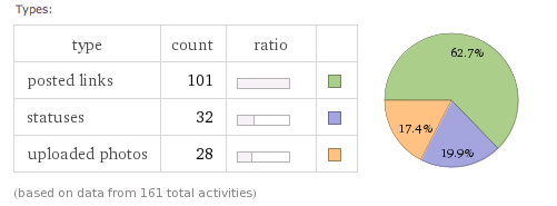
first launched its Facebook data-mining module in August 2012. Users could leverage the platform’s computational abilities to analyze and visualize their weekly distribution of Facebook posts, types of posts (photos, links, status updates), weekly app activity, frequency of particular words in posts, and more. This latest update isn’t radical, but it does offer some interesting new features. “One of the most shared pods from our first release was our colorful social network visualization,” read a Jan. 23 note on the
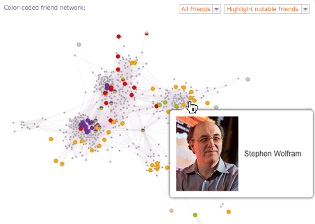
Wolfram Alpha Blog. “We’re extending this idea to help you better understand how your social network fits together. To start with, we’re showing you a new visualization that highlights friends based on the way that they fit into your network.” As part of that new visualization, Wolfram Alpha groups friends into five different “network roles,” including social insiders and outsiders, social neighbors and gateways, and social connectors. While these groups sometimes overlap on the platform’s graphs, there’s a lot that makes them distinct. From the blog posting:
“Social insiders and outsiders are opposites: a social insider has a lot of friends in common with you (e.g. your girlfriend since freshman year); conversely, a social outsider is someone with whom you have few or no mutual friends (e.g. that girl you met horseback riding in Romania). Social gateways and neighbors are also opposites: a social gateway contact has a lot of friends that are outside your network (e.g. the editor of your college newspaper), whereas a social neighbor has few friends outside your network (e.g. your identical twin).”
Visually, it looks like this:

Wolfram Alpha has added color coding for “interesting” friend properties, including relationship status, age, sex, and so on; users can also slice their network data by metrics such as location and age. In theory, that allows curious users to gain some pretty unique insights from their Facebook data—for example, one can see whether all your friends in your current town are the same age. There’s quite a bit of geographical-related data on display, too, including which friends live the furthest away. “Looking to the future, we’re happy to announce another new aspect to Personal Analytics for Facebook: Facebook Historical Analytics,” the blog post concluded. “By enabling this feature now (click the banner at the top of your report), we’ll start periodically collecting information to be able to show you an evolution of your Facebook profile over time. Which of your friends has gotten married? Who has moved to a new city? You’ll get an email when there is enough data to show you a historical analysis.” Wolfram Alpha’s Facebook update arrives days after
Facebook announced Graph Search, which allows users to search the massive social network for posts, photos, friends, “Likes,” and other content. Graph Search supports lengthy natural-language queries in search of information; for example, someone interested in gathering friends for a movie night might type in something like, “Friends of friends who live in New York and like Tarantino films.” Graph Search could increase Facebook’s utility as a source for dates, job recruitment, restaurant information, and much more. In theory, that would make the social network a more robust competitor to Google as an indexer of online information.
Image: Wolfram Alpha
 Wolfram Alpha has added color coding for “interesting” friend properties, including relationship status, age, sex, and so on; users can also slice their network data by metrics such as location and age. In theory, that allows curious users to gain some pretty unique insights from their Facebook data—for example, one can see whether all your friends in your current town are the same age. There’s quite a bit of geographical-related data on display, too, including which friends live the furthest away. “Looking to the future, we’re happy to announce another new aspect to Personal Analytics for Facebook: Facebook Historical Analytics,” the blog post concluded. “By enabling this feature now (click the banner at the top of your report), we’ll start periodically collecting information to be able to show you an evolution of your Facebook profile over time. Which of your friends has gotten married? Who has moved to a new city? You’ll get an email when there is enough data to show you a historical analysis.” Wolfram Alpha’s Facebook update arrives days after Facebook announced Graph Search, which allows users to search the massive social network for posts, photos, friends, “Likes,” and other content. Graph Search supports lengthy natural-language queries in search of information; for example, someone interested in gathering friends for a movie night might type in something like, “Friends of friends who live in New York and like Tarantino films.” Graph Search could increase Facebook’s utility as a source for dates, job recruitment, restaurant information, and much more. In theory, that would make the social network a more robust competitor to Google as an indexer of online information. Image: Wolfram Alpha
