Mapping remains one of the oldest and most powerful ways of visualizing data, allowing people to track events and clusters of activity at a glance. Centuries ago, long before Hadoop let companies crunch massive amounts of data,
doctors could use maps to track the cause of a Cholera epidemic to a particular street corner water pump. Now, crowdmapping and Big Data are birthing new and more sophisticated ways to map the world around us.
Bikes
Dotting the streets of Washington D.C. are racks of bicycles that pedestrians can rent for a few dollars a day. While these bikesharing programs are becoming popular in other cities—New York is set to roll its one out sometime soon—the D.C. program has been in place for about a year, with more than 1600 bikes spread across the city in 175 different locations. Now that it’s established a foothold of sorts in the District, Capital Bikeshare wants to expand across the Potomac River into the Arlington, Virginia suburbs. The company decided to crowdsource where to put these new locations, and
set up a site to collect suggestions. The map offers locations suggested by the community and those recommended by county planners, as well as existing bike stations. Simply put, it’s something that would have been impossible a few short years ago, when mapping tools were more expensive and finicky to code up.
Shining a Light
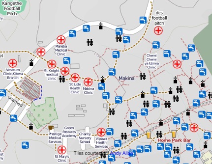
Other successful crowdmaps are found in more unusual locations—including places with little continuous electricity or Internet access, many of them in the third world. Just outside of Nairobi, Kenya sits a neighborhood called Kibera, which until a few years ago was a blank spot on most online maps. That was before a bunch of residents decided to map their own community using online open-source mapping tools. It has grown into a complete interactive community project; as you can see from the map below, important locations such as running water and clinics are now revealed on the map:
Take a look at another third-world crowdmap: this effort, called
Women Under Siege, has been documenting the history of sexual violence attacks in Syria. As the site's creators state on their home page: "We are relying on you to help us discover whether rape and sexual assault are widespread—such evidence can be used to aid the international community in grasping the urgency of what is happening in Syria, and can provide the base for potential future prosecutions." You can filter the reports by the type of attack or neighborhood, and also add your own report to the map.
Hyper-Local
One of the first community mapping efforts took place in 2007, when Adrian Holovaty mapped city crime reports to the local police precincts. That site, EveryBlock.com, was subsequently purchased by MSNBC and expanded to 18 other cities around the U.S., including Seattle and Miami. "Our goal is to help you be a better neighbor, by giving you frequently updated neighborhood news, plus tools to have meaningful conversations with neighbors," reads the Website's About page. With EveryBlock, you can set up a custom page with your particular neighborhood and receive email alerts whenever crime reports and other hyperlocal news items are posted to the site. The site now pulls together a variety of information besides crime reports, including building permits, restaurant inspections, and local Flickr photos. The map interface renders the information alive and meaningful to anyone living near these events. Another effort,
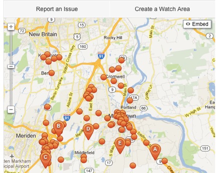
SeeClickFix, offers mobile apps for reporting problems to a government. Various communities used it after being hard-hit by Superstorm Sandy in October; take this example from around Middletown, Connecticut:
During that storm, Google put together its own
Sandy Crisis Map, featuring open gas stations and other data points to help storm victims find shelter or resources.
Wineries
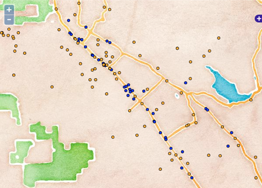
Onto something a bit lighter: the next map is from California's Napa Valley, home to 900 or so wineries within a few miles of each other.
David Smith’s map (below) shows each winery and when it’s open, whether appointments are required for tastings, and so on. Once this project began, Barry Rowlingson added on to it using R to help with the statistics. It’s just a couple of guys using open source APIs to build maps that make it easier to navigate around Napa's wineries:

Tight Focus
Several cities have implemented real-time transit maps that show the length of the wait for your next bus or streetcar—take a look at the dozens of transit systems available via
NextBus's website, which mostly focuses on US-based locations. And there are plenty of others:
Toronto's map can be found here, for example, and
Helsinki's transit map can be found here. You can mouse-over the icons on the map to get more details about the particular transit method. The best thing about these sorts of sites are that they are very simple to use and encourage people to take transit, since they can see quite readily when their next bus or tram will arrive at their stop. Popular crowdmap sites include
Crowdmap.com,
ushahidi.com and
Openstreetmap.org, along with
efforts from Google. They are all worthy projects, and combine a variety of geo-locating tools with wiki-style commenting features and interfaces to attach programs to extend their utility. If you want learn more, here is
a Web-based tutorial offered by Google's Mapmaker blog that will show you the simple steps involved in creating your own crowd map and how to find the data to begin your explorations. And here’s a
similar tutorial for CrowdMap. Good luck with finding your own map to some interesting data relationships.
 Take a look at another third-world crowdmap: this effort, called Women Under Siege, has been documenting the history of sexual violence attacks in Syria. As the site's creators state on their home page: "We are relying on you to help us discover whether rape and sexual assault are widespread—such evidence can be used to aid the international community in grasping the urgency of what is happening in Syria, and can provide the base for potential future prosecutions." You can filter the reports by the type of attack or neighborhood, and also add your own report to the map.
 During that storm, Google put together its own Sandy Crisis Map, featuring open gas stations and other data points to help storm victims find shelter or resources.
