Microsoft, preparing to release Windows 8 into the wild, has decided to show off
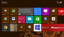
the OS's new logo. Designing this probably wasn't easy for the company. It dumped its traditional four-color Windows logo, first introduced with Windows 3.1 in 1992. The new version combines both modern and classic characteristics, drawing influence from the Windows 8 Metro interface. It uses bold flat colors and clean lines and shapes, similar to Metro's elements. The logo's color varies; "each time you change your color, the logo changes to reflect you," Microsoft says. It'll be interesting to see if Redmond will make more changes before the Windows 8 official announcement. For me, it's very strange that they dropped a logo that almost every PC user recognized. It could be a risky decision--just like the one to
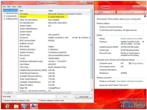
remove the Start button. If everything goes according to plan, Windows 8 will be released at the end of 2012 (RTM version). It'll be the first version of Windows to support ARM microprocessors besides the X86 microprocessors from AMD and Intel. If you're going to miss the old logos and want to see how they've evolved over the years, here you are: