Our new interface will eventually expand dynamically to accommodate different screen sizes and user preferences, but until then you can pick the information density that you prefer.He also warned that "some Labs features may look a little strange in the new themes." Maybe. But so far everything looks great on my side. Source: Gmail Blog
Google's Giving Gmail a New, Smart Interface
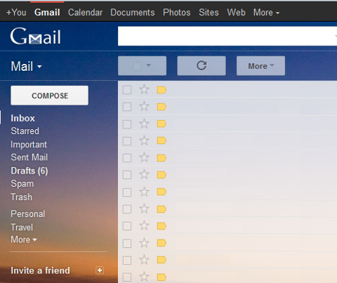
The Googlers in Mountain View must be having much fun refreshing the designs of some of its most popular products. After splashing some black and red paint on the search engine, now they're giving Gmail a makeover. It'll probably be months before you see any changes, but if you just can't wait, just switch to the "Preview" or "Preview (Dense)" Gmail theme. The former has greater spacing, ideal for touch-based devices, while the dense version is, well, denser (though still roomier than any of the old themes). You don't have to be a minimalist to love the new interface. It's way cleaner and less complex than today's, all without compromising existing features. And did I mention the buttons are huge? According to Jason Cornwell, the Gmail user experience designer, both the themes will eventually be consolidated: