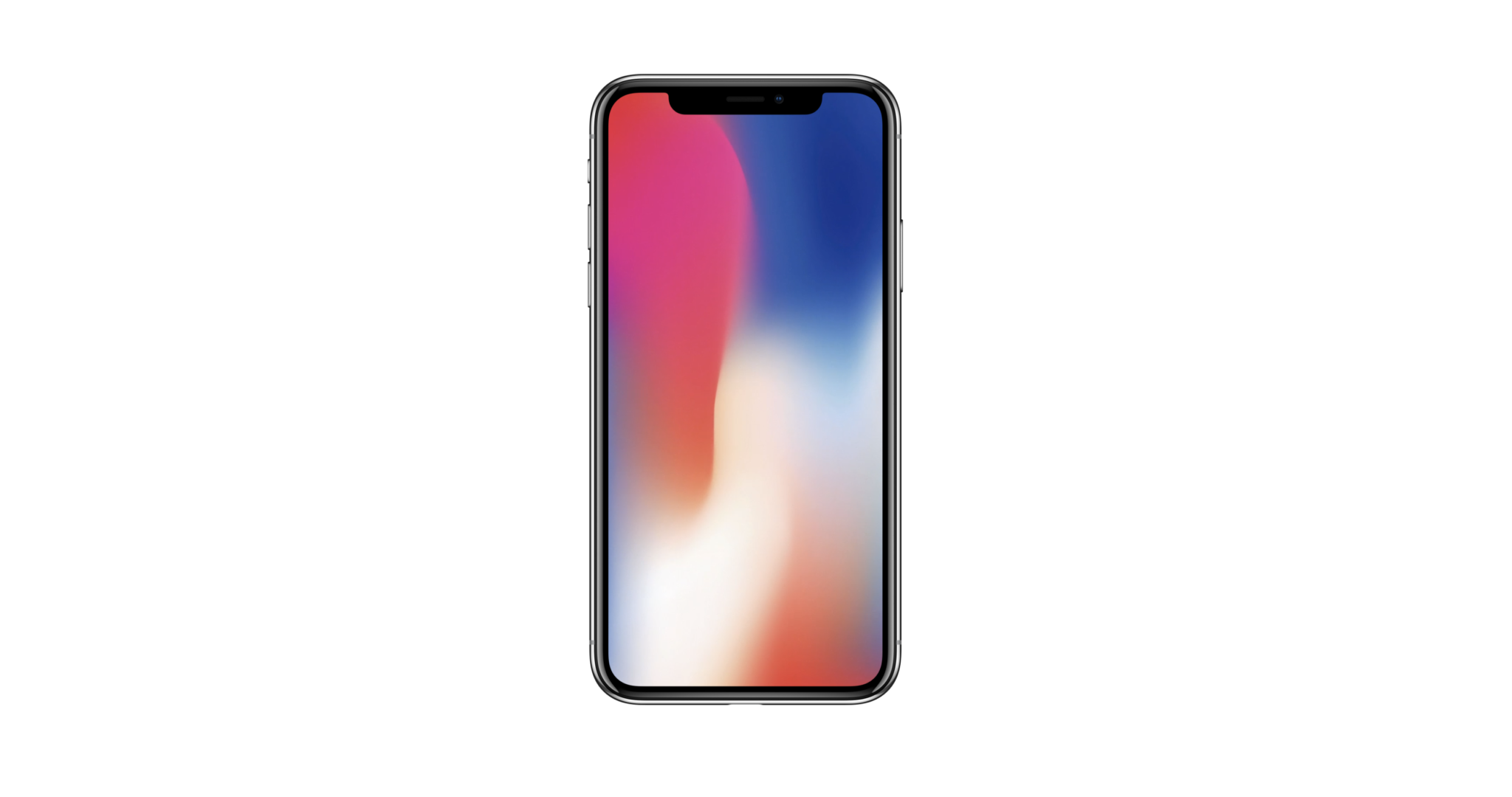
 iPhone X[/caption] Apple’s recently announced iPhone X is coming soon. With just over a month until pre-orders begin, developers are hard at work making sure their apps "embrace the notch": that is, the small insert containing various sensors that lives at the top of the screen. Here’s what you need to know. First, let’s consider the notch itself. Apple refers the components contained therein as the ‘True Depth Camera System,’ and the area itself as the ‘System Housing.’ So when we discuss it, the technically correct thing to say would be: "How to design around the Sensor Housing," but we’re not going to do that. ‘Notch’ is simpler. Within the notch lies eight unique sensors, cameras and projectors that perform a few tasks. Most critically, this hardware suite unlocks the phone using Apple’s new Face ID system. It’s also a 3D selfie camera, which developers currently can’t tap into (though you can expect that restriction to relax over time). [caption id="attachment_143484" align="aligncenter" width="2184"]
 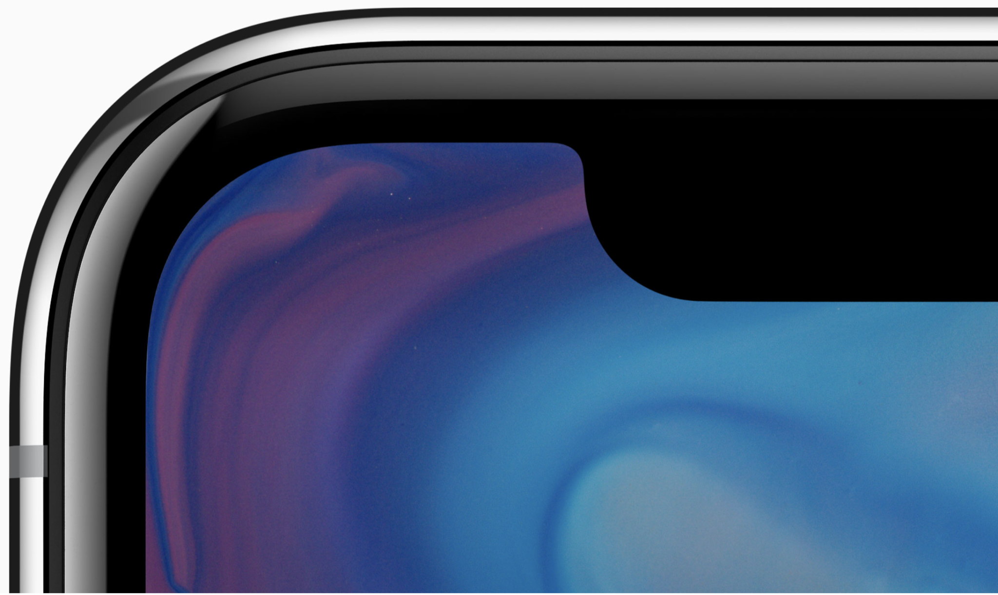 iPhone X Curved Screen and Notch[/caption]
Ears, Notches and Curves
On the sides of the notch are ‘ears.’ These ears display status indicators and the time. Swiping down on the left ear brings up the notification center, and swiping down on the right ear gets you to the control center. Swiping up from the bottom of the device is now limited to navigating through apps or back to the home screen. The home button is gone. The screen is curved at every corner, which brings up the first consideration for developers. As when creating an app icon, there’s no reason to try to meet the curves yourself; instead, let the system do any heavy lifting. Yes, iOS 11 will trim the corners for you, which helps your app remain immersive and avoid any sort of mathematical errors that happen when you try to figure out eight (four corners, four around the notch) different radii for the screen. But what of the notch? This is where things get tricky on an app development level. You have to read between the lines. Apple Music offers a nice card layout for artists, songs and albums – which feels like a wink-and-a-nudge to developers and designers who create every kind of app. While explicitly designing the notch's presence into an app is prohibited in Apple’s Human Interface Guidelines, card-based interactions are not. [caption id="attachment_143570" align="aligncenter" width="1462"]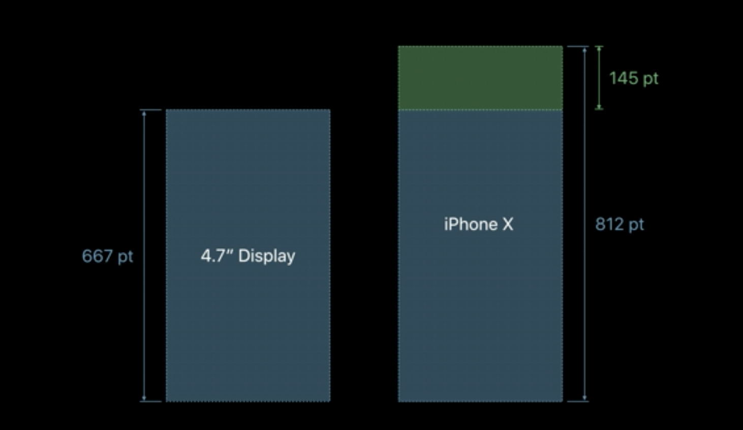 iPhone X Display Height[/caption] More to the point, Apple Music’s card format is gesture-based. For developers trying to design apps for iPhone X, that makes Apple Music a blueprint for how to successfully build apps (in addition to being a $10-per-month streaming service, of course). The ears sit atop a large banner area designed to encompass search across the system. It’s another befuddling take on iOS 11 on the iPhone X. While the device's screen is the same width as that of an iPhone 8, it is a good deal taller; and yet it’s not directly representative of the space ‘stolen’ by the top banner. This is something to keep in mind when choosing buffers for table views.
Apple: Embrace the notch! Black bars would waste valuable screen real estate. Also Apple: pic.twitter.com/9b24ixjvBJ
— Chris Masterson (@chrismasterson) September 13, 2017
Safe Areas
Apple says developers should avoid placing buttons or actionable items near the ears or bottom of the screen. Up top, this is to avoid accidental triggering of the notification or control centers. Below, it’s meant as a measure to avoid accidentally going to the home-screen or other apps. Persistent across all apps is a bar that reminds users that gestures rule the day on iPhone X: it’s a visual cue to swipe up to get to the home-screen or into multitasking, or that swiping left or right switches to other apps (like a four-finger swipe on iPad). A system framework calledsafeAreaLayoutGuide manages all of this, and is something developers can expect Apple to monitor closely in the app review process from here on out. Its aim is to keep actionable, in-app buttons and items in the center of the screen. In portrait mode, it manages the top and bottom as well as a slight buffer along the side rails. [caption id="attachment_143571" align="aligncenter" width="1248"] 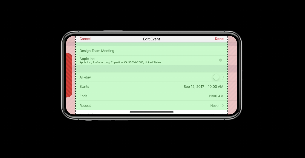 iPhone X safe area[/caption] In landscape,
 safeAreaLayoutGuide helps developers avoid the ears. Some developers and designers are imagining how to best utilize those areas, while others are simply lamenting the lack of symmetry in Apple’s new display.
Quick mockup of using the iPhone X "ears" as buttons in say iBooks for example. cc @stroughtonsmith pic.twitter.com/ckWX93VT3d
— Mihir Joshi (@riffola) September 14, 2017
It gets better! In addition to carefully maneuvering around notches and bottom-dwelling bars, developers should realize that an app’s child view safe area can also be manipulated. A good example: a photo editing app where filters or toggles adorn the side or bottom of a view. In addition to making sure your app’s safe layout is correct, this code helps manage the child view:[screaming internally] pic.twitter.com/OwdBRaZk5Y
— Cam Hunt (@camh) September 12, 2017
override func viewDidAppear(_ animated: Bool) { var newSafeArea = view.safeAreaInsets // Adjust the safe area to accommodate // the width of the side view. if let sideViewWidth = sideView?.bounds.size.width { newSafeArea.right += sideViewWidth } // Adjust the safe area to accommodate // the height of the bottom view. if let bottomViewHeight = bottomView?.bounds.size.height { newSafeArea.bottom += bottomViewHeight } // Adjust the safe area insets of the // embedded child view controller. let child = self.childViewControllers[0] child.additionalSafeAreaInsets = newSafeArea }
Embracing the Notch
There are a few hard truths about the notch. First, you can't cheat your way around it by making apps card-formatted with black backgrounds. In landscape, table views extend the width of the device, while cell content is inset to avoid the edges and that notch. It looks wonky because it’s immersive – but content in its current iteration isn’t. There’s no clean way to design around the notch. Case in point:One of the better examples of how to #embracethenotch is CARROT Weather. Developer Brian Mueller tells Dice: “It was super easy to get everything ready for the iPhone X, even with a very custom layout like CARROT Weather has. It’d be a snap with an app using more stock UI components.” He went on to note that he actually prefers how CARROT looks with the notch, as “weather effects get to extend up higher.”I think I’ve fixed the notch issue in landscape 🍾 #iphoneX pic.twitter.com/hGytyO3DRV
— Vojta Stavik (@vojtastavik) September 13, 2017
This is another example of why it’s best to use Swift (or Objective-C) and Apple’s provided frameworks when building iOS apps. Auto Layout and theIf this doesn’t make you want to spend $1,000 in November, I don’t know what will. pic.twitter.com/cpgDhQIcxq
— CARROT (@CARROT_app) September 13, 2017
safeAreaLayoutGuide make for an easier transition. From there, massaging how controllers handle viewed data may be as simple as changing the size of those views. If you’re using something else, such as React, the move to iOS 11 and the iPhone X won’t be so fluid.