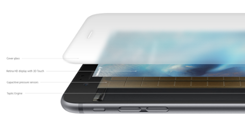
[caption id="attachment_140261" align="aligncenter" width="1684"] An iPhone Touch Bar Concept. Credit: AGVideos[/caption] The next iPhone may present a radical departure from the device that developers have come to love writing apps for. New rumors point to hardware that is a bit more ‘Pro’ than a typical iPhone, which in turn could shift the development paradigm forever. That’s not obsequious lip-service, either. A Wall Street Journal piece about the next iPhone suggests Apple will eliminate the physical Home button that’s become as iconic as the device itself, and introduce a “USB-C port for the power cord,” which likelymeans future chargers are USB-C-to-Lightning (not that the phone will use USB-C). But why get rid of the Home button? Apple was recently awarded a patent for technology that embeds the biometric sensors used for Touch ID into the display itself. The display on the next iPhone is said to be larger, and notable analyst Ming Chi-Kuo says a ‘function area’ will be added to the bottom of the screen. The dimensions of the next iPhone will be just as we know them now, according to Ming. So where we find a 4.7-inch display on the iPhone 7, we’ll get a 5.8-inch screen on the new model – but only 5.15 inches will be actual display. The remaining 0.65 inches will be reserved for a ‘function area.’ A ‘function area’ could very well be similar to the ‘Touch Bar’ we see on new MacBooks Pro. The next-generation iPhones are also said to have an OLED display, ditching the LCD panels Apple has used for so long. (The Macbook Touch Bar is OLED and is 60px high, which is about 0.65 inches.) [caption id="attachment_140254" align="aligncenter" width="800"] Analyst portrayal of an iPhone with Touch Bar. Credit: KGI Research[/caption]
Can iPhone be Innovative?
The ‘function area’ is not a new concept. The LG V10 uses something eerily similar to what Ming describes, placing what amounts to a dynamic notification bar at the top of the phone. LG has also been bandied about as a possible supplier of OLED displays to Apple. Reviewing the LG V10, Android Central’s Phil Nickinson summed the second screen up as “interesting and mostly innocuous”:
Time, date, battery and weather are always at the ready in the top right corner of the screen. And that's handy. And the notifications that you're used to seeing stretched across the top of the screen end up there as well, and you get used to it eventually, though it is a little weird no longer looking at the left edge of the phone for the first word of a notification. Music controls are handy there, as are shortcuts for contacts.
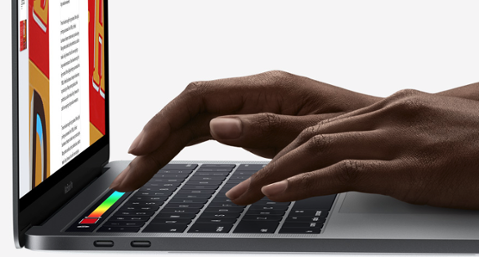
If you trust analyst impressions, Apple will put its ‘function area’ at the bottom of the screen. Strange as it may seem, that opens up a lot more possibilities. When it comes to one-handed use, most of us can’t easily reach the entirety of the screen with a thumb. There’s an official hack for that – lightly double-tapping the home button to bring the top of the screen down – but it’s not ideal. On the MacBook Pro, the Touch Bar is just below the screen, as well. It’s best thought of as a visual representation of keyboard shortcuts. Apple could do something very similar with the iPhone. Currently, switching between tabs in Safari for iOS is a clumsy process of tapping, swiping and picking from a top-down view of open tabs. On the Touch Bar, it’s a matter of swiping until you land on the right page. The Touch Bar is also customizable; I have buttons for ‘home’ and ‘new tab’ on mine, but I could change those to alter my workflow, too. Most stock Apple apps for macOS take advantage of the Touch Bar. Good third-party apps such as Airmail do, as well, and I’ve found using those apps with Touch Bar to be transformative. [caption id="attachment_140255" align="aligncenter" width="1200"] The MacBook Pro Touch Bar[/caption]
The ‘Function Area’ and Developers
MacBooks Pro give us a good idea of how dedicated, customizable function areas work for users, but what about developing for it? We only have the MacBooks Pro for inspiration here. It’s not the perfect example (macOS uses AppKit, which is not found on iOS), but it’s still a good precursor to what may be coming. Apple’s Human Interface guidelines are also indicative of its thinking with ‘function areas.’ In a nutshell, Apple asks developers not to make the Touch Bar a ‘must-use’ feature, avoid animations and make it possible to begin and end a session within the Touch Bar itself. (If you start editing a photo using the Touch Bar, you should have enough tools at your disposal to finish the job without having to touch the keyboard or trackpad.) Apple also suggests developers avoid multi-touch experiences and rely on icons instead of text, which is great for one-handed iPhone use. But the actual development process will remain familiar to developers for iOS. One of the simpler pieces of the development process, having a sub-menu pop up after tapping an icon, is a breathy process on macOS. What is conservatively 90 lines of code on macOS is reduced to 20 lines for iOS (both using Swift). Via Stack Overflow:
There’s no direct comparison for iOS and macOS here (because there’s no Touch Bar on an iPhone, and macOS uses AppKit), but this is a glimpse of how iOS would handle popover menus using UIViewcontroller. MacOS doesn't handle menus with view controllers, which contributes to its lengthy process. Conceptually, developers would get something along the lines of ‘UITouchBar’ to directly access and interact with a ‘function area.’ While another thing to keep track of, the development process should remain familiar. Digging a bit through UIViewController, there are several processes (responding to events and state restoration, for example) that would be suitable for something like UITouchBar. Unlike macOS, iPhone's Touch Bar may hand off certain processes to a full-screen superview, considering its size restrictions on the iPhone. [caption id="attachment_137345" align="aligncenter" width="1657"] Apple Pay On macOS Sierra[/caption]
Why Touch Bar for iPhone?
Though tech pros voiced concerns about Touch Bar on the Mac, it alters workflows for professional and casual users alike. For iOS, it would allow for more full-screen experiences. Here’s an example: a side-scrolling game where a character runs until killed could be controlled with the Touch Bar; sliding a finger up (in landscape mode, mind you) would control how high the character jumped over obstacles without a user ever needing to touch the screen. In Portrait mode, an app like Pages or Notes could avoid obstructing menus for making text bold or italic, instead kicking such functionality to the Touch Bar (as the Mac does). This also makes the cross-platform experience a bit more relatable for those who like to use multiple devices and the cloud to sync files. A possible pain-point is that a static function area would end up below the keyboard, which may cause some to ignore it for certain tasks while typing. Apple could resign the Touch Bar while the keyboard is up, but it would still be handy as an emoji picker, and would be really handy for things like iMessage app-switching. (It's also not meant to be something you use all the time anyway.) If you’re looking for a shorter version of ‘why’ Apple would do such a thing, it’s easy: they can, and it’s progressive. Regardless of how you feel about the MacBook’s Touch Bar, using it is a great experience. So long as Apple nails the more important features on the iPhone (like Touch ID) and figures out how they apply to/may affect large initiatives (like Apple Pay) with a new hardware scheme, Touch Bar opens up a lot of avenues for users and developers to get excited about.
[caption id="attachment_140261" align="aligncenter" width="1684"] An iPhone Touch Bar Concept. Credit: AGVideos[/caption] The next iPhone may present a radical departure from the device that developers have come to love writing apps for. New rumors point to hardware that is a bit more ‘Pro’ than a typical iPhone, which in turn could shift the development paradigm forever. That’s not obsequious lip-service, either. A Wall Street Journal piece about the next iPhone suggests Apple will eliminate the physical Home button that’s become as iconic as the device itself, and introduce a “USB-C port for the power cord,” which likelymeans future chargers are USB-C-to-Lightning (not that the phone will use USB-C). But why get rid of the Home button? Apple was recently awarded a patent for technology that embeds the biometric sensors used for Touch ID into the display itself. The display on the next iPhone is said to be larger, and notable analyst Ming Chi-Kuo says a ‘function area’ will be added to the bottom of the screen. The dimensions of the next iPhone will be just as we know them now, according to Ming. So where we find a 4.7-inch display on the iPhone 7, we’ll get a 5.8-inch screen on the new model – but only 5.15 inches will be actual display. The remaining 0.65 inches will be reserved for a ‘function area.’ A ‘function area’ could very well be similar to the ‘Touch Bar’ we see on new MacBooks Pro. The next-generation iPhones are also said to have an OLED display, ditching the LCD panels Apple has used for so long. (The Macbook Touch Bar is OLED and is 60px high, which is about 0.65 inches.) [caption id="attachment_140254" align="aligncenter" width="800"] Analyst portrayal of an iPhone with Touch Bar. Credit: KGI Research[/caption]
Can iPhone be Innovative?
The ‘function area’ is not a new concept. The LG V10 uses something eerily similar to what Ming describes, placing what amounts to a dynamic notification bar at the top of the phone. LG has also been bandied about as a possible supplier of OLED displays to Apple. Reviewing the LG V10, Android Central’s Phil Nickinson summed the second screen up as “interesting and mostly innocuous”:
Time, date, battery and weather are always at the ready in the top right corner of the screen. And that's handy. And the notifications that you're used to seeing stretched across the top of the screen end up there as well, and you get used to it eventually, though it is a little weird no longer looking at the left edge of the phone for the first word of a notification. Music controls are handy there, as are shortcuts for contacts.
If you trust analyst impressions, Apple will put its ‘function area’ at the bottom of the screen. Strange as it may seem, that opens up a lot more possibilities. When it comes to one-handed use, most of us can’t easily reach the entirety of the screen with a thumb. There’s an official hack for that – lightly double-tapping the home button to bring the top of the screen down – but it’s not ideal. On the MacBook Pro, the Touch Bar is just below the screen, as well. It’s best thought of as a visual representation of keyboard shortcuts. Apple could do something very similar with the iPhone. Currently, switching between tabs in Safari for iOS is a clumsy process of tapping, swiping and picking from a top-down view of open tabs. On the Touch Bar, it’s a matter of swiping until you land on the right page. The Touch Bar is also customizable; I have buttons for ‘home’ and ‘new tab’ on mine, but I could change those to alter my workflow, too. Most stock Apple apps for macOS take advantage of the Touch Bar. Good third-party apps such as Airmail do, as well, and I’ve found using those apps with Touch Bar to be transformative. [caption id="attachment_140255" align="aligncenter" width="1200"] The MacBook Pro Touch Bar[/caption]
The ‘Function Area’ and Developers
MacBooks Pro give us a good idea of how dedicated, customizable function areas work for users, but what about developing for it? We only have the MacBooks Pro for inspiration here. It’s not the perfect example (macOS uses AppKit, which is not found on iOS), but it’s still a good precursor to what may be coming. Apple’s Human Interface guidelines are also indicative of its thinking with ‘function areas.’ In a nutshell, Apple asks developers not to make the Touch Bar a ‘must-use’ feature, avoid animations and make it possible to begin and end a session within the Touch Bar itself. (If you start editing a photo using the Touch Bar, you should have enough tools at your disposal to finish the job without having to touch the keyboard or trackpad.) Apple also suggests developers avoid multi-touch experiences and rely on icons instead of text, which is great for one-handed iPhone use. But the actual development process will remain familiar to developers for iOS. One of the simpler pieces of the development process, having a sub-menu pop up after tapping an icon, is a breathy process on macOS. What is conservatively 90 lines of code on macOS is reduced to 20 lines for iOS (both using Swift). Via Stack Overflow:
There’s no direct comparison for iOS and macOS here (because there’s no Touch Bar on an iPhone, and macOS uses AppKit), but this is a glimpse of how iOS would handle popover menus using UIViewcontroller. MacOS doesn't handle menus with view controllers, which contributes to its lengthy process. Conceptually, developers would get something along the lines of ‘UITouchBar’ to directly access and interact with a ‘function area.’ While another thing to keep track of, the development process should remain familiar. Digging a bit through UIViewController, there are several processes (responding to events and state restoration, for example) that would be suitable for something like UITouchBar. Unlike macOS, iPhone's Touch Bar may hand off certain processes to a full-screen superview, considering its size restrictions on the iPhone. [caption id="attachment_137345" align="aligncenter" width="1657"] Apple Pay On macOS Sierra[/caption]
Why Touch Bar for iPhone?
Though tech pros voiced concerns about Touch Bar on the Mac, it alters workflows for professional and casual users alike. For iOS, it would allow for more full-screen experiences. Here’s an example: a side-scrolling game where a character runs until killed could be controlled with the Touch Bar; sliding a finger up (in landscape mode, mind you) would control how high the character jumped over obstacles without a user ever needing to touch the screen. In Portrait mode, an app like Pages or Notes could avoid obstructing menus for making text bold or italic, instead kicking such functionality to the Touch Bar (as the Mac does). This also makes the cross-platform experience a bit more relatable for those who like to use multiple devices and the cloud to sync files. A possible pain-point is that a static function area would end up below the keyboard, which may cause some to ignore it for certain tasks while typing. Apple could resign the Touch Bar while the keyboard is up, but it would still be handy as an emoji picker, and would be really handy for things like iMessage app-switching. (It's also not meant to be something you use all the time anyway.) If you’re looking for a shorter version of ‘why’ Apple would do such a thing, it’s easy: they can, and it’s progressive. Regardless of how you feel about the MacBook’s Touch Bar, using it is a great experience. So long as Apple nails the more important features on the iPhone (like Touch ID) and figures out how they apply to/may affect large initiatives (like Apple Pay) with a new hardware scheme, Touch Bar opens up a lot of avenues for users and developers to get excited about.
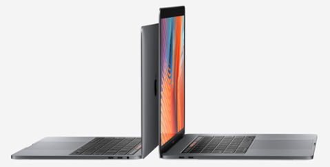
[caption id="attachment_137961" align="aligncenter" width="880"] MacBook Pro Touch Bar[/caption] Apple’s new MacBook Pro with Touch Bar, a touch-sensitive strip that can display a range of customizable icons, d…
[caption id="attachment_137982" align="aligncenter" width="1464"] MacBook Pro with Touch Bar[/caption] The most polarizing and alluring part of the new MacBook Pros is the Touch Bar, a small touch-capacitive sc…
Apple sold 13 million iPhone 6S and 6S Plus smartphones over the weekend. That’s a significant increase over last year’s release of the iPhone 6 and 6 Plus, which collectively sold 10 million units during their…
Create Your Profile
Sign up for a free Dice profile, add your resume, discover great career insights and set your tech career in motion.
 An iPhone Touch Bar Concept. Credit: AGVideos[/caption] The next iPhone may present a radical departure from the device that developers have come to love writing apps for. New rumors point to hardware that is a bit more ‘Pro’ than a typical iPhone, which in turn could shift the development paradigm forever. That’s not obsequious lip-service, either. A Wall Street Journal piece about the next iPhone suggests Apple will eliminate the physical Home button that’s become as iconic as the device itself, and introduce a “USB-C port for the power cord,” which likely means future chargers are USB-C-to-Lightning (not that the phone will use USB-C). But why get rid of the Home button? Apple was recently awarded a patent for technology that embeds the biometric sensors used for Touch ID into the display itself. The display on the next iPhone is said to be larger, and notable analyst Ming Chi-Kuo says a ‘function area’ will be added to the bottom of the screen. The dimensions of the next iPhone will be just as we know them now, according to Ming. So where we find a 4.7-inch display on the iPhone 7, we’ll get a 5.8-inch screen on the new model – but only 5.15 inches will be actual display. The remaining 0.65 inches will be reserved for a ‘function area.’ A ‘function area’ could very well be similar to the ‘Touch Bar’ we see on new MacBooks Pro. The next-generation iPhones are also said to have an OLED display, ditching the LCD panels Apple has used for so long. (The Macbook Touch Bar is OLED and is 60px high, which is about 0.65 inches.) [caption id="attachment_140254" align="aligncenter" width="800"]
 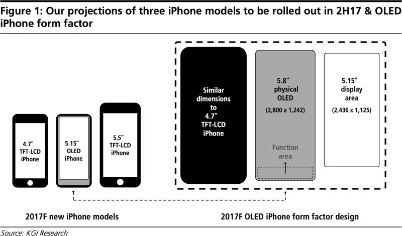 Analyst portrayal of an iPhone with Touch Bar. Credit: KGI Research[/caption]
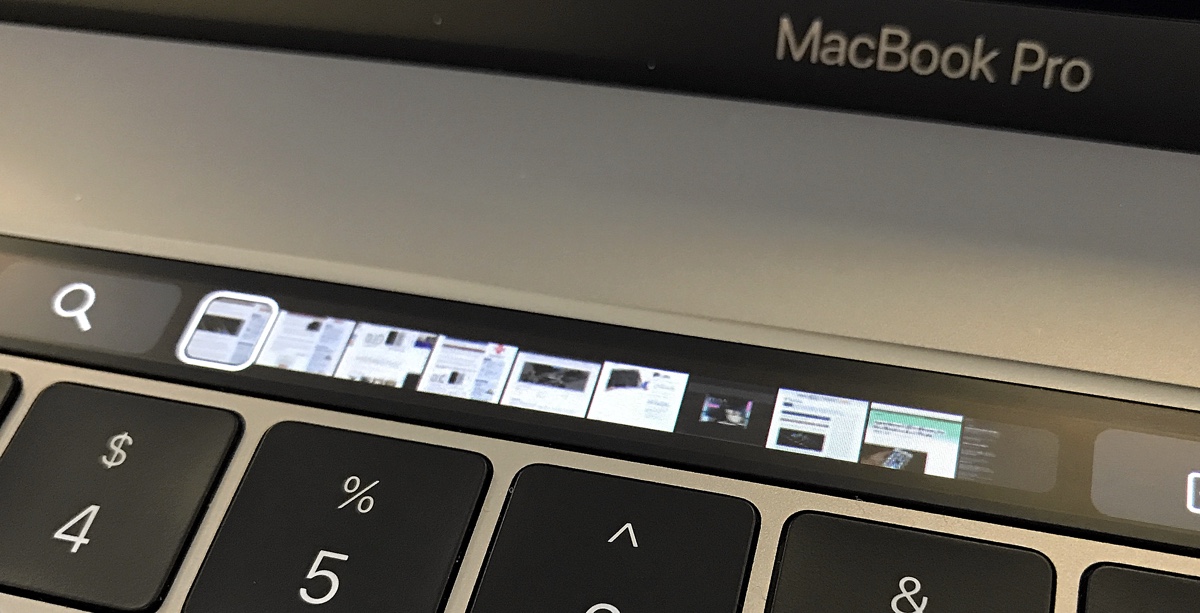 The MacBook Pro Touch Bar[/caption]
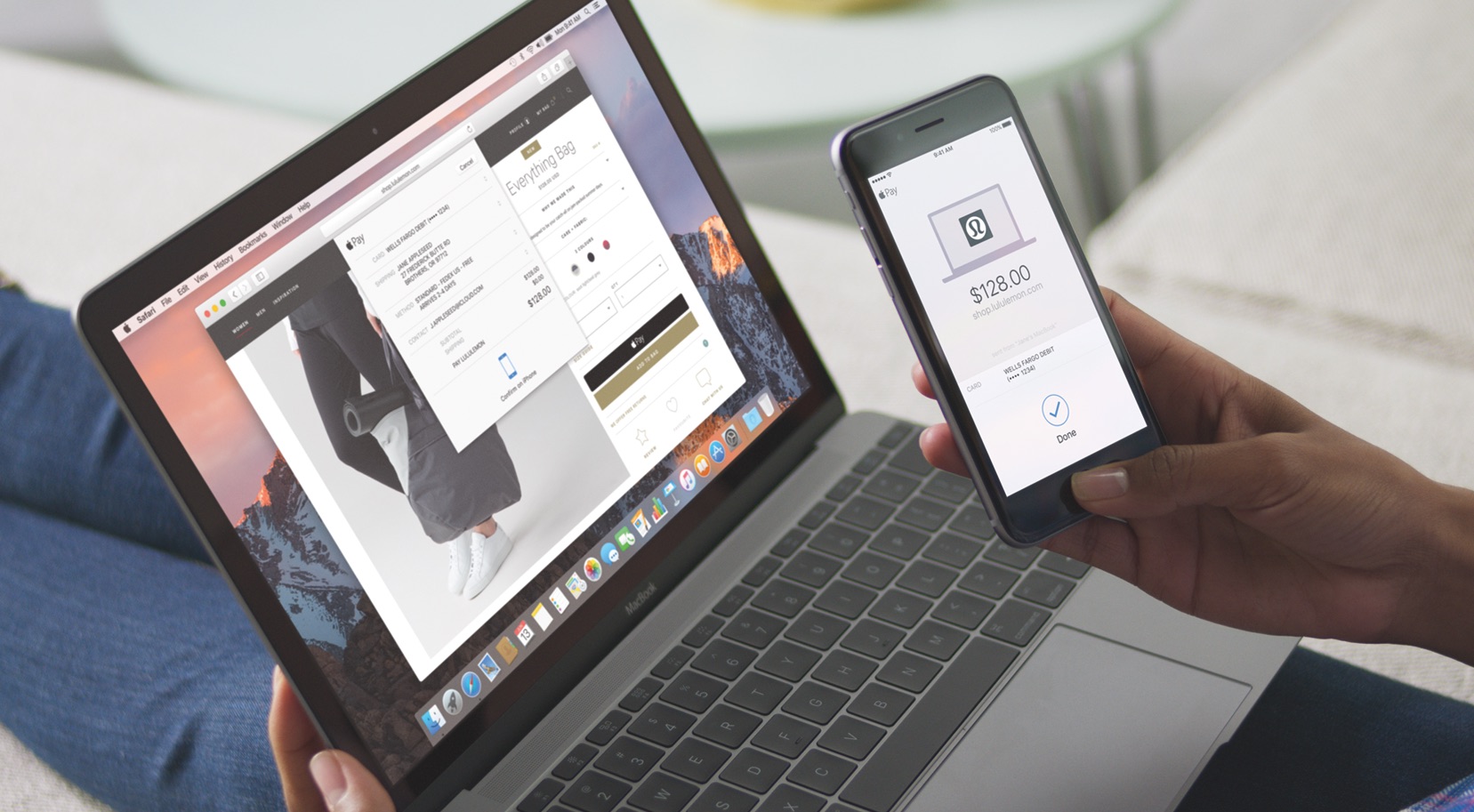 Apple Pay On macOS Sierra[/caption]