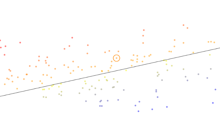
For an updated version of this visualization, please click here. At Dice, we have a lot of discussions about which technology skills and titles are hot and in demand right now, and which are less desirable. Such talks are important, as they drive many aspects of our business, from the number of applicants for a given job, to the salary offered by employers. To better understand this concept, we can think of this as a problem of supply and demand. In this case, 'supply' is the number of job seekers who have a given skill, while 'demand' is the number of jobs listing a particular skill. If we take these numbers and normalize them so their values lie in the same range, then divide the demand value by the supply for a given skill, we get a number that indicates how in-demand or ‘hot’ a particular skill is. ‘Hot’ skills get a number higher than 1 (more demand than supply), while skills that are less in demand getting a number less than 1. I call this concept the ‘Demand Ratio.' In the chart above, I have performed a supply-and-demand analysis using the top 700 technology skills and top 400 job titles in our current dataset. However, to optimize the experience for slower machines and mobile browsers, I have defaulted to 200 titles and skills; click “Larger Dataset” if you want the more complete list (that will take longer to render). If a skill or title is not on the chart when “Larger Dataset’ is selected, it is because it is not common enough right now to make the list. I could have included even more data points, but that would have caused performance problems.
How to Use This Chart
The
red points on the chart are the ‘hot’ skills, while the
blue points are the less-in-demand skills. The black line represents the dividing line between ‘hot’ and ‘not’, based on our dataset. You can click on a skill or title to center it, and click once more to zoom in on that item. By default, the chart uses a
log scale; otherwise the dots are too close together to easily discern due to the skewed distribution. You can switch this off by un-checking the ‘log scale’ check box. If you want to find a particular skill or title on the chart, use the drop-down to locate it.
‘Reset’ resets the chart’s current zoom level. The chart shows some interesting trends. The in-demand skills and titles (the red ones) seem to be largely focused around DevOps work, front-end development (ASP.NET, Angular.js) and Big Data (MongoDB, Hadoop, NoSQL, AWS). The less in-demand skills include some legacy technology (COBOL, Mainframe, Solaris), as well as very common high-supply skills (Windows 2000, Visual Studio). Adobe Flash seems to be on the way out (0.33 demand ratio), while HTML5 is highly in demand (2.82 demand ratio). If we focus on job titles, we not only see many of the same trends present when analyzing skills, but also that management titles (e.g., IT manager, Director, Marketing Manager) tend to be high supply and low demand, as presumably more people want to move into management than there are positions available. This is also seems true for project managers and business analysts, two of our most common titles, as these reflect more senior positions that often lead into management positions (in my experience). To construct this chart I used the excellent
C3.js charting library built on top of the
D3.js data visualization library from Mike Bostock.
Simon Hughes is the chief data scientist of the Dice Data Science Team.

