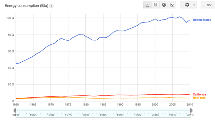
 U.S. energy consumption by selected states.[/caption] When building Big Data apps, you need to conduct a test run with someone else’s data before you put the software into production. Why? Because using an unfamiliar dataset can help illuminate any flaws in your code, perhaps making it easier to test and perfect your underlying algorithms. To that end, there are a number of public data sources freely available for use. Some of them are infamous, such as the Enron email archive used in court hearings about the malfeasance of that company. It’s one of the largest collections of actual emails, and has proven useful for anti-spam vendors to test their own algorithms. Indeed, the archive may be the best and most enduring legacy of Enron. More prosaic data sources include the complete works of Shakespeare, available online and easily incorporated into testing plans. Another good place to look is this list of 23 mainly health-related data sets, including various open data initiatives, cancer statistics, and more. Then there’s this collection that Princeton has put together—mostly a large collection of texts such as presidential debate transcripts and literary works that are now part of the public domain. Another popular data destination is the digitized archives of the New York Times, with 150 years’ worth of archives. There are more than 30,000 subject tags and the information can be downloaded either as RDF or HTML format. The archive was opened to programmers three years ago and has an extensive data dictionary. There is detailed documentation of its various APIs and a discussion group for those that want to learn more about how to interact with this information. In addition, there are some specialized datasets and APIs, such as the books on its various bestseller lists, and a Web console where you can assemble your queries inside your browser. (You need to obtain a search key from their developer network first.)
Public Data: Where to Test Your Next Big Data App
[caption id="attachment_3659" align="aligncenter" width="432"]  U.S. energy consumption by selected states.[/caption] When building Big Data apps, you need to conduct a test run with someone else’s data before you put the software into production. Why? Because using an unfamiliar dataset can help illuminate any flaws in your code, perhaps making it easier to test and perfect your underlying algorithms. To that end, there are a number of public data sources freely available for use. Some of them are infamous, such as the Enron email archive used in court hearings about the malfeasance of that company. It’s one of the largest collections of actual emails, and has proven useful for anti-spam vendors to test their own algorithms. Indeed, the archive may be the best and most enduring legacy of Enron. More prosaic data sources include the complete works of Shakespeare, available online and easily incorporated into testing plans. Another good place to look is this list of 23 mainly health-related data sets, including various open data initiatives, cancer statistics, and more. Then there’s this collection that Princeton has put together—mostly a large collection of texts such as presidential debate transcripts and literary works that are now part of the public domain. Another popular data destination is the digitized archives of the New York Times, with 150 years’ worth of archives. There are more than 30,000 subject tags and the information can be downloaded either as RDF or HTML format. The archive was opened to programmers three years ago and has an extensive data dictionary. There is detailed documentation of its various APIs and a discussion group for those that want to learn more about how to interact with this information. In addition, there are some specialized datasets and APIs, such as the books on its various bestseller lists, and a Web console where you can assemble your queries inside your browser. (You need to obtain a search key from their developer network first.)
 U.S. energy consumption by selected states.[/caption] When building Big Data apps, you need to conduct a test run with someone else’s data before you put the software into production. Why? Because using an unfamiliar dataset can help illuminate any flaws in your code, perhaps making it easier to test and perfect your underlying algorithms. To that end, there are a number of public data sources freely available for use. Some of them are infamous, such as the Enron email archive used in court hearings about the malfeasance of that company. It’s one of the largest collections of actual emails, and has proven useful for anti-spam vendors to test their own algorithms. Indeed, the archive may be the best and most enduring legacy of Enron. More prosaic data sources include the complete works of Shakespeare, available online and easily incorporated into testing plans. Another good place to look is this list of 23 mainly health-related data sets, including various open data initiatives, cancer statistics, and more. Then there’s this collection that Princeton has put together—mostly a large collection of texts such as presidential debate transcripts and literary works that are now part of the public domain. Another popular data destination is the digitized archives of the New York Times, with 150 years’ worth of archives. There are more than 30,000 subject tags and the information can be downloaded either as RDF or HTML format. The archive was opened to programmers three years ago and has an extensive data dictionary. There is detailed documentation of its various APIs and a discussion group for those that want to learn more about how to interact with this information. In addition, there are some specialized datasets and APIs, such as the books on its various bestseller lists, and a Web console where you can assemble your queries inside your browser. (You need to obtain a search key from their developer network first.)